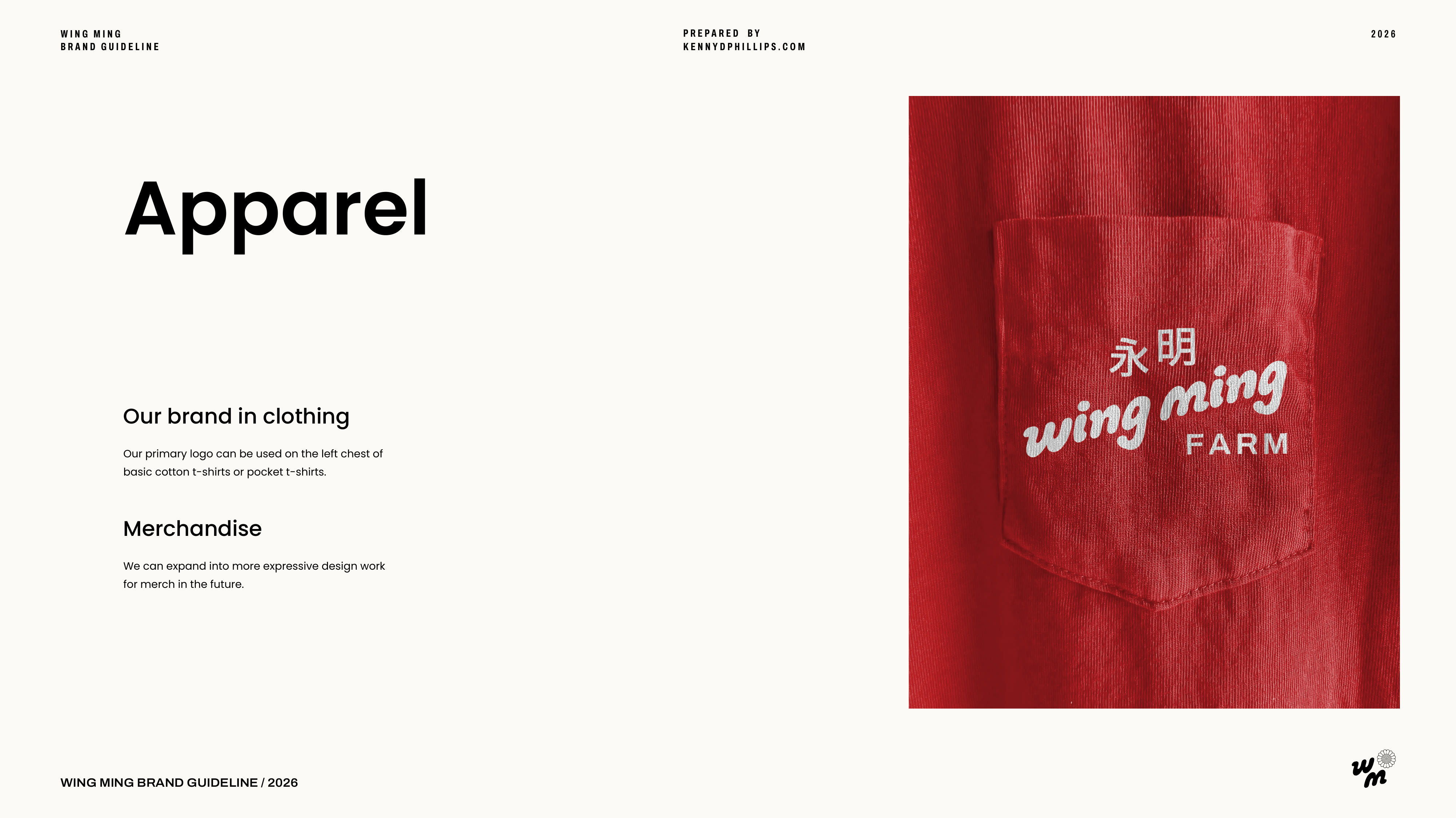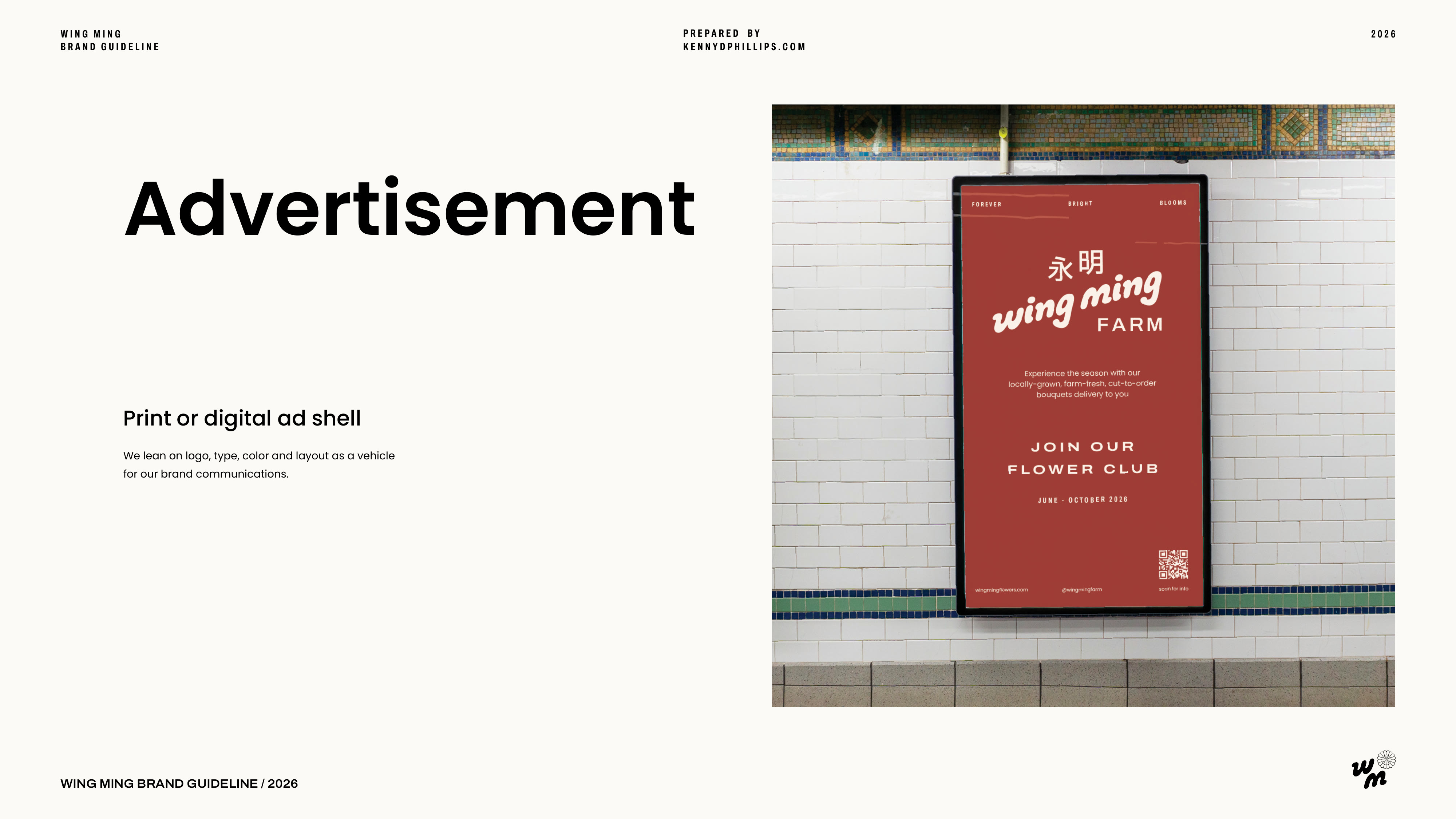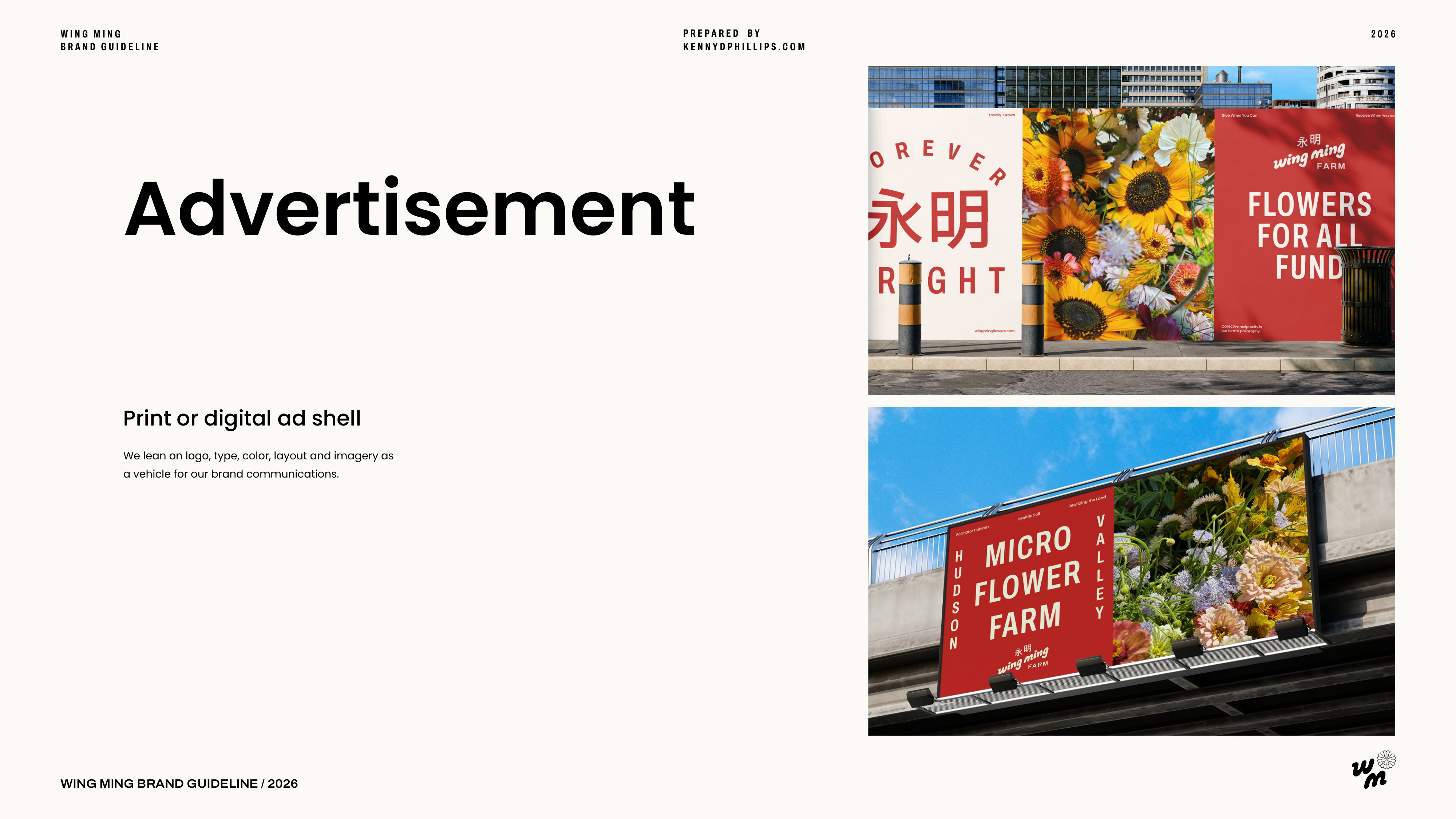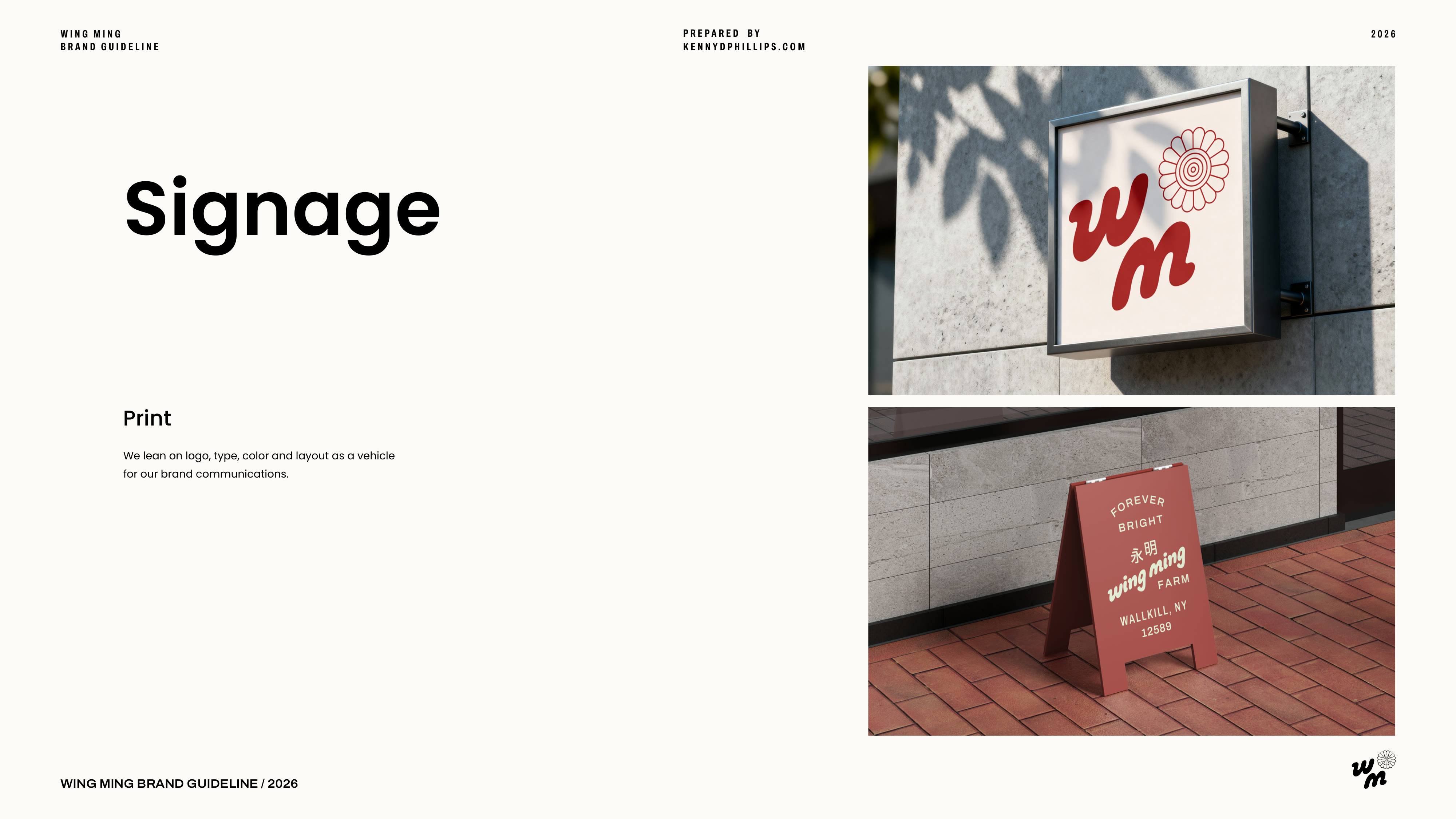
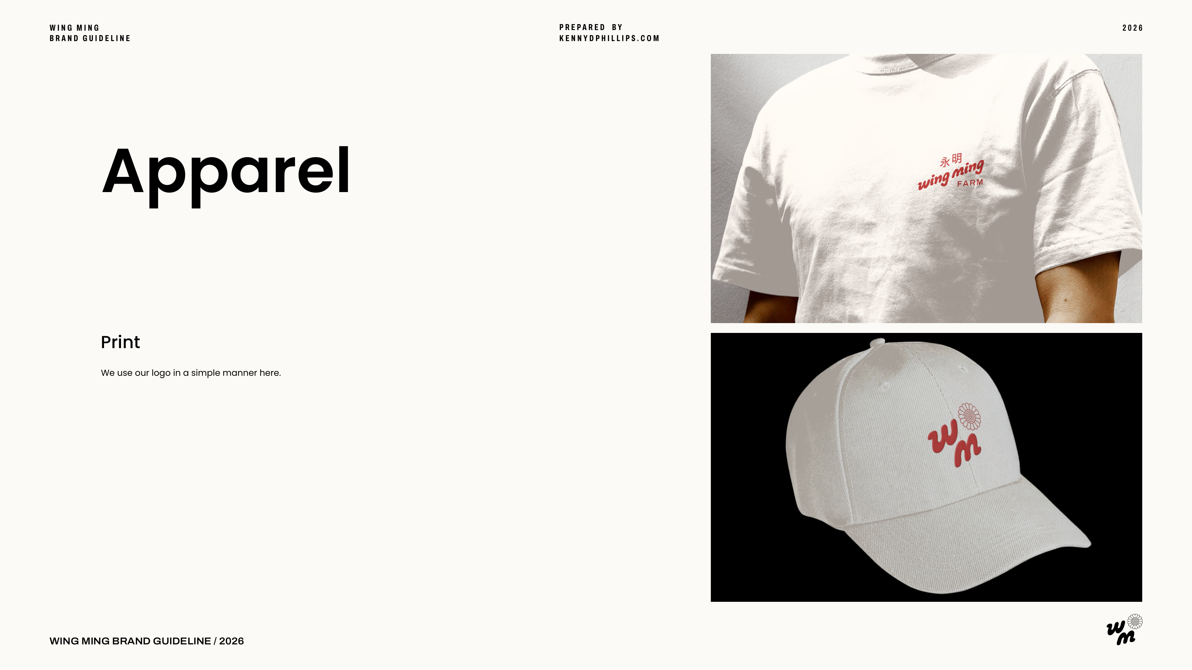
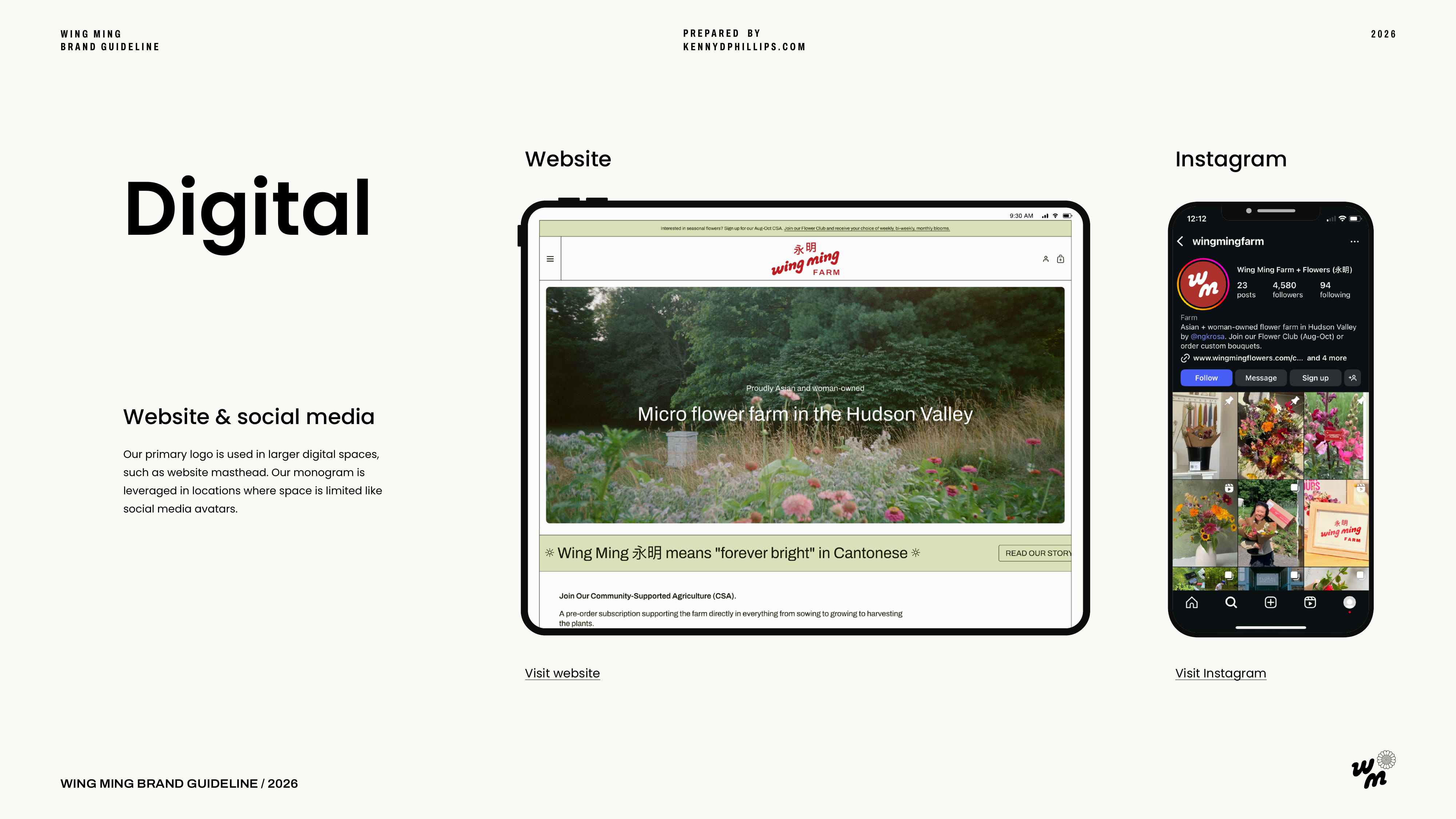
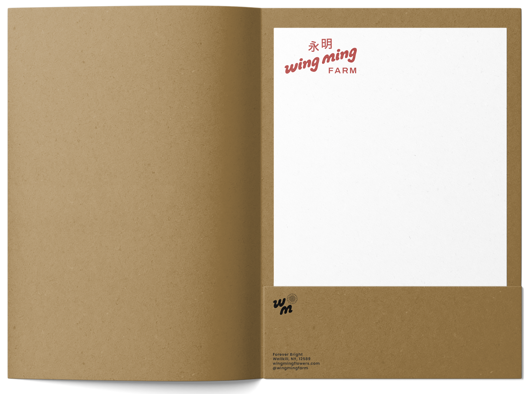
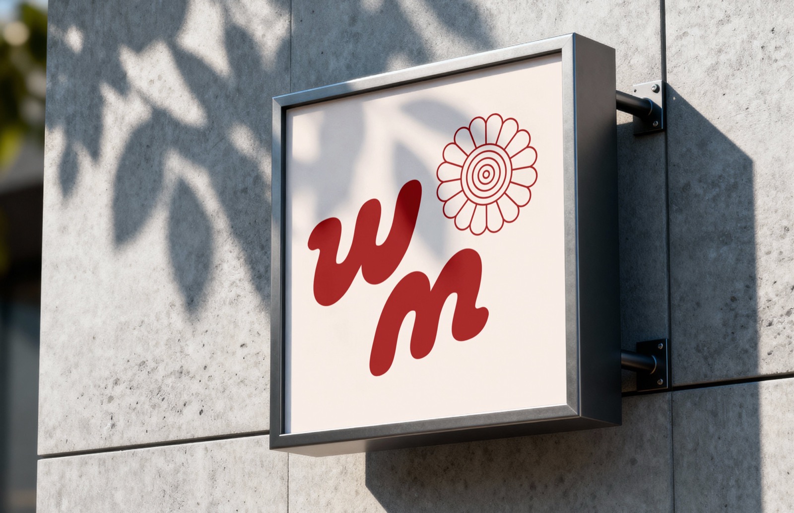
Brand IdentityLogoGuidelinesPrintWebSignage
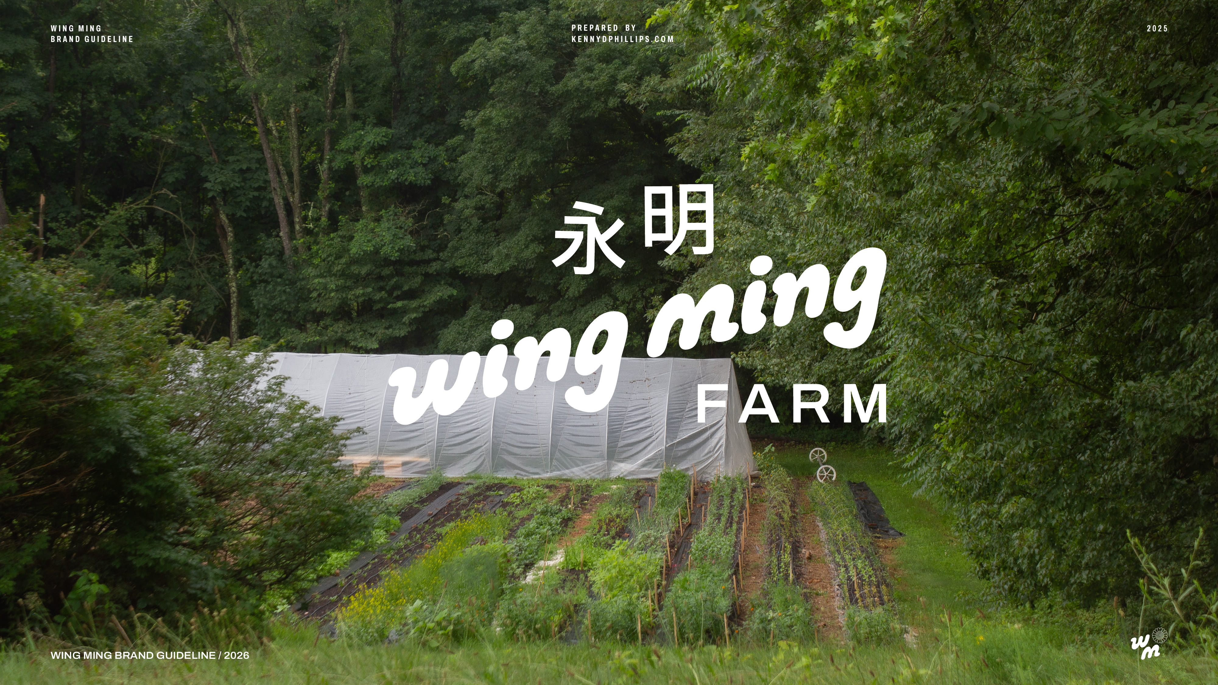
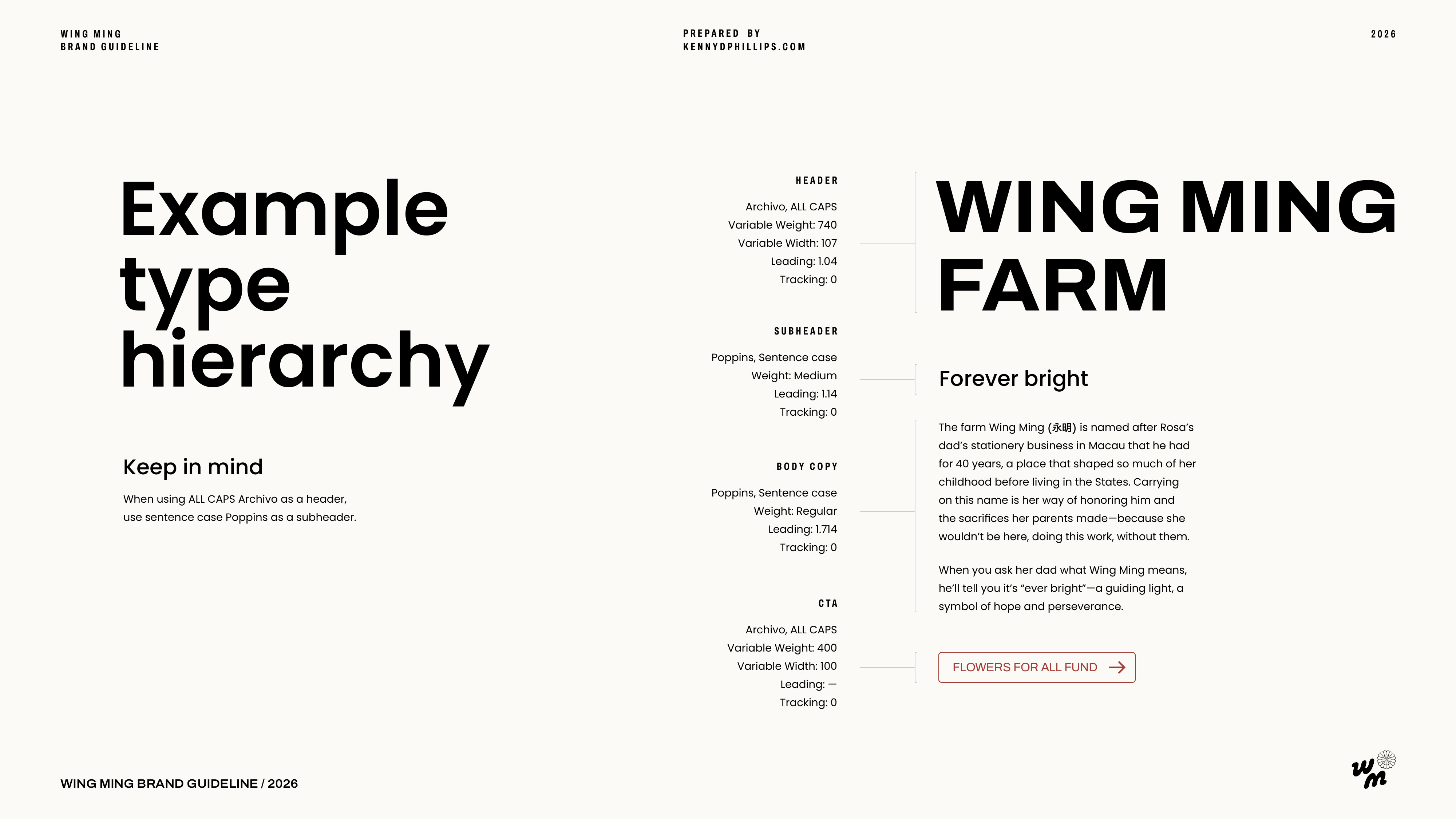
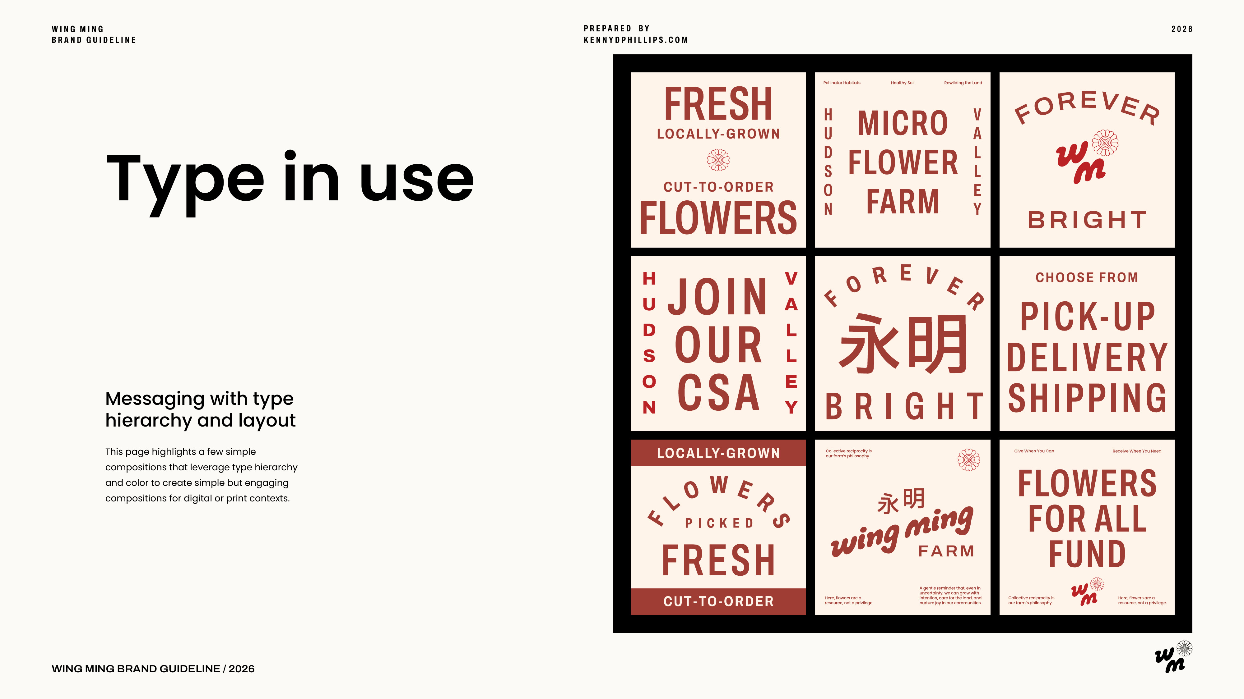
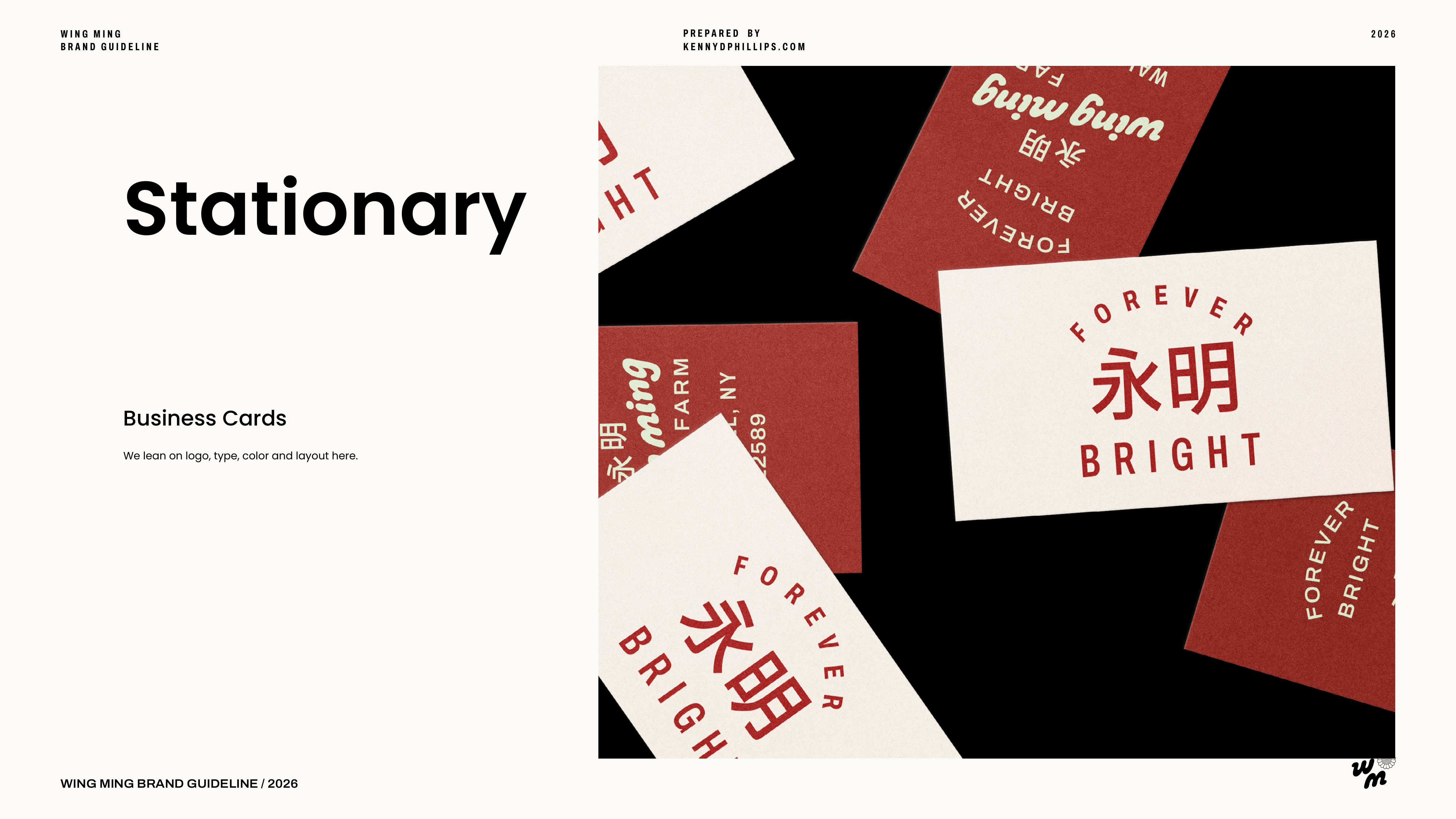
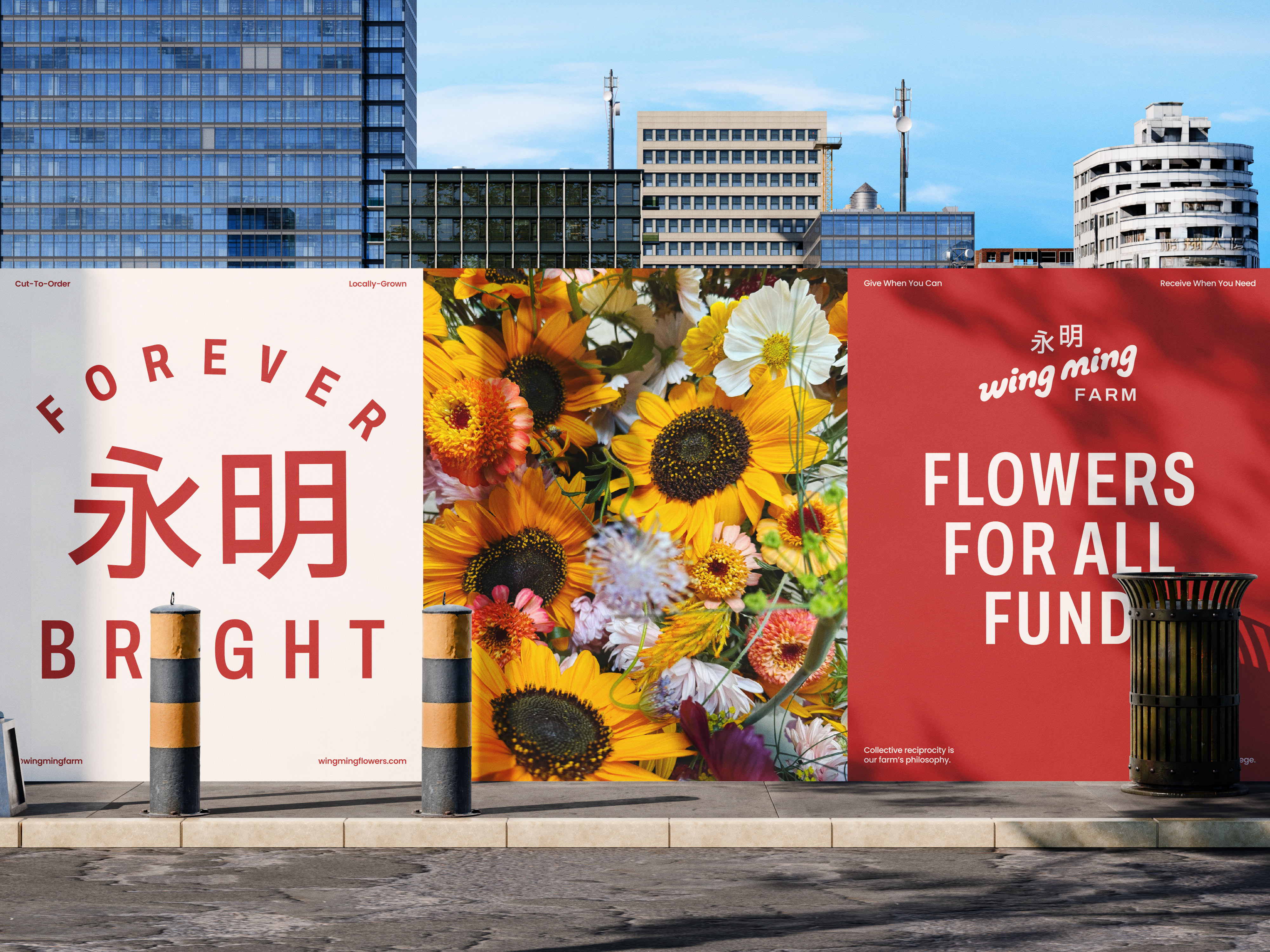
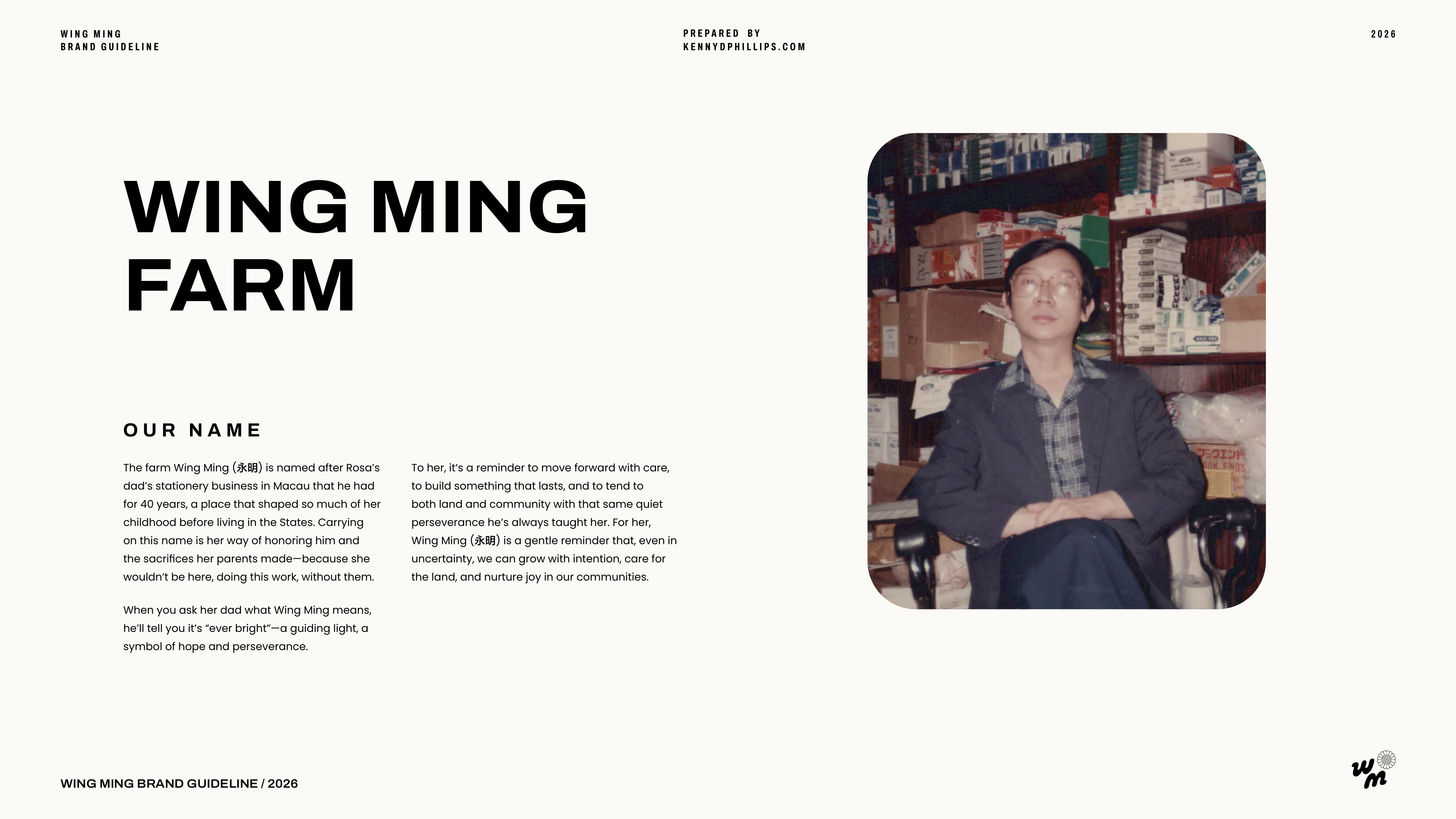
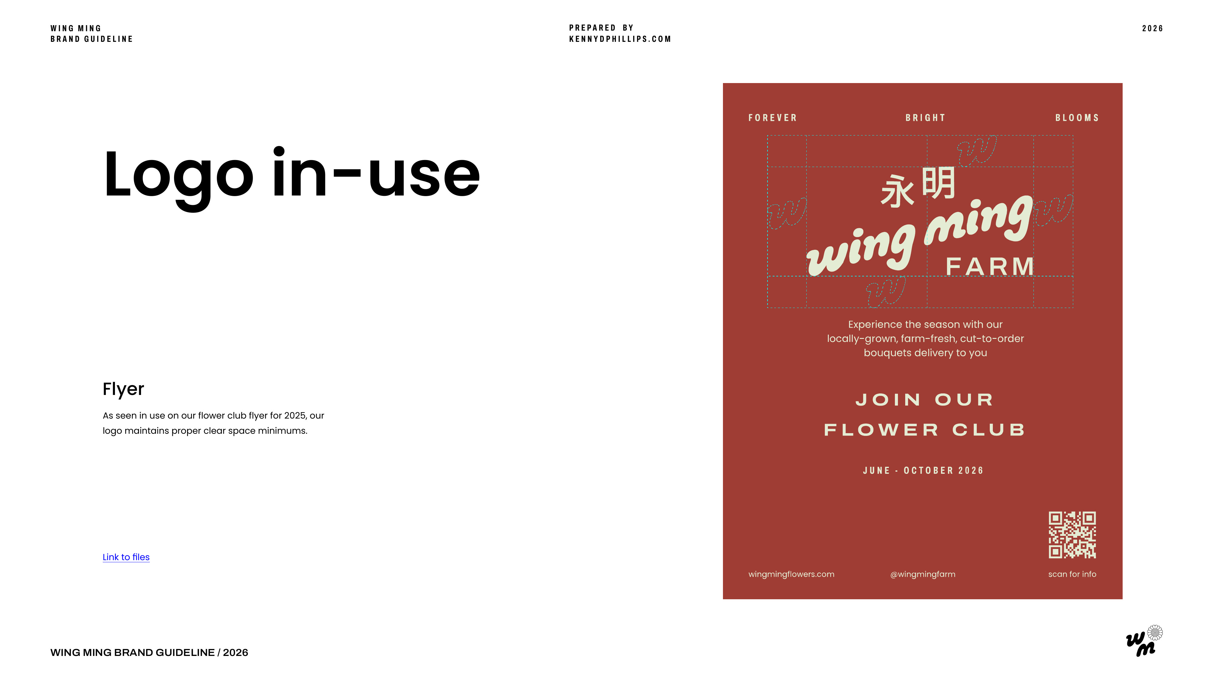
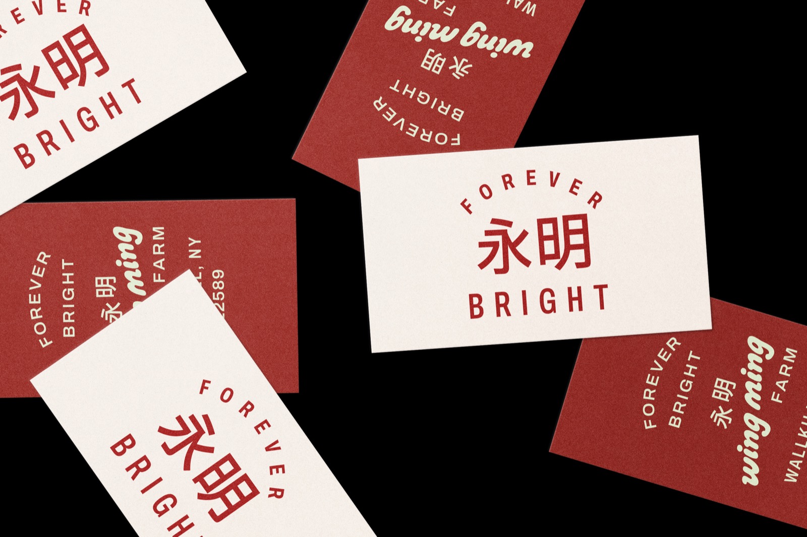
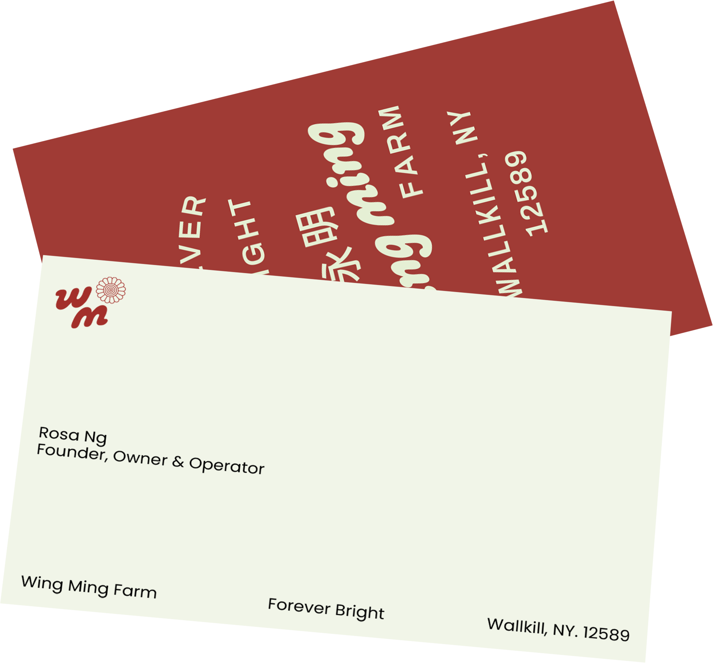
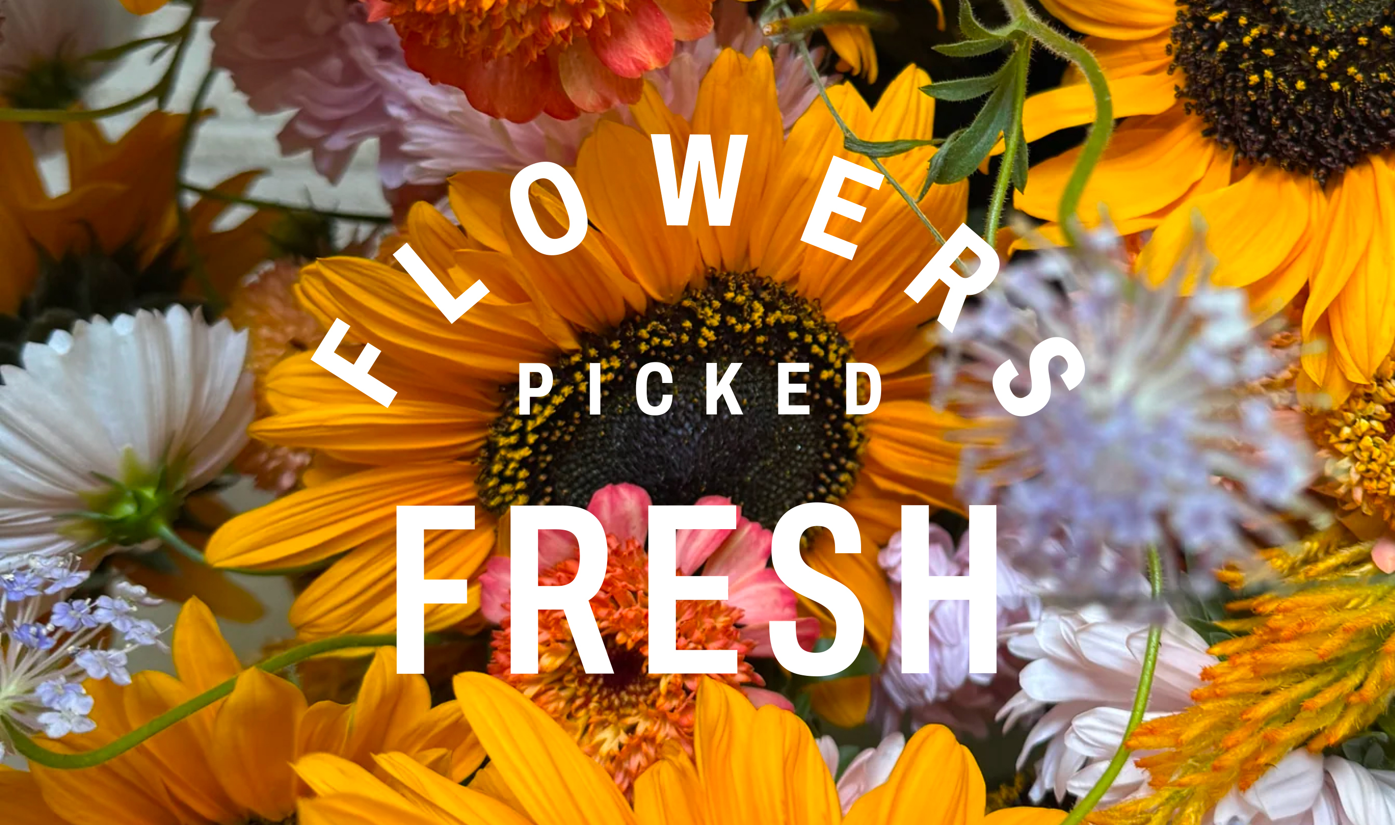
Wing Ming is a flower farm and CSA rooted in the Hudson Valley. The owner grows, arranges and delivers flowers to the local community and beyond. Wing Ming means forever bright in Cantonese. Flowers are among the most fleeting things you can possess, and yet the feeling they leave behind stays with you. This tension is at the core of the brand system. There is an intentional playfulness to the logotype and a permanence to the layout, color and typographic approach.

The identity is considered enough to carry the weight of a serious craft and business, yet playful enough to communicate the light-hearted side of flowers. The brand system was built to honor both sides without ignoring either one.
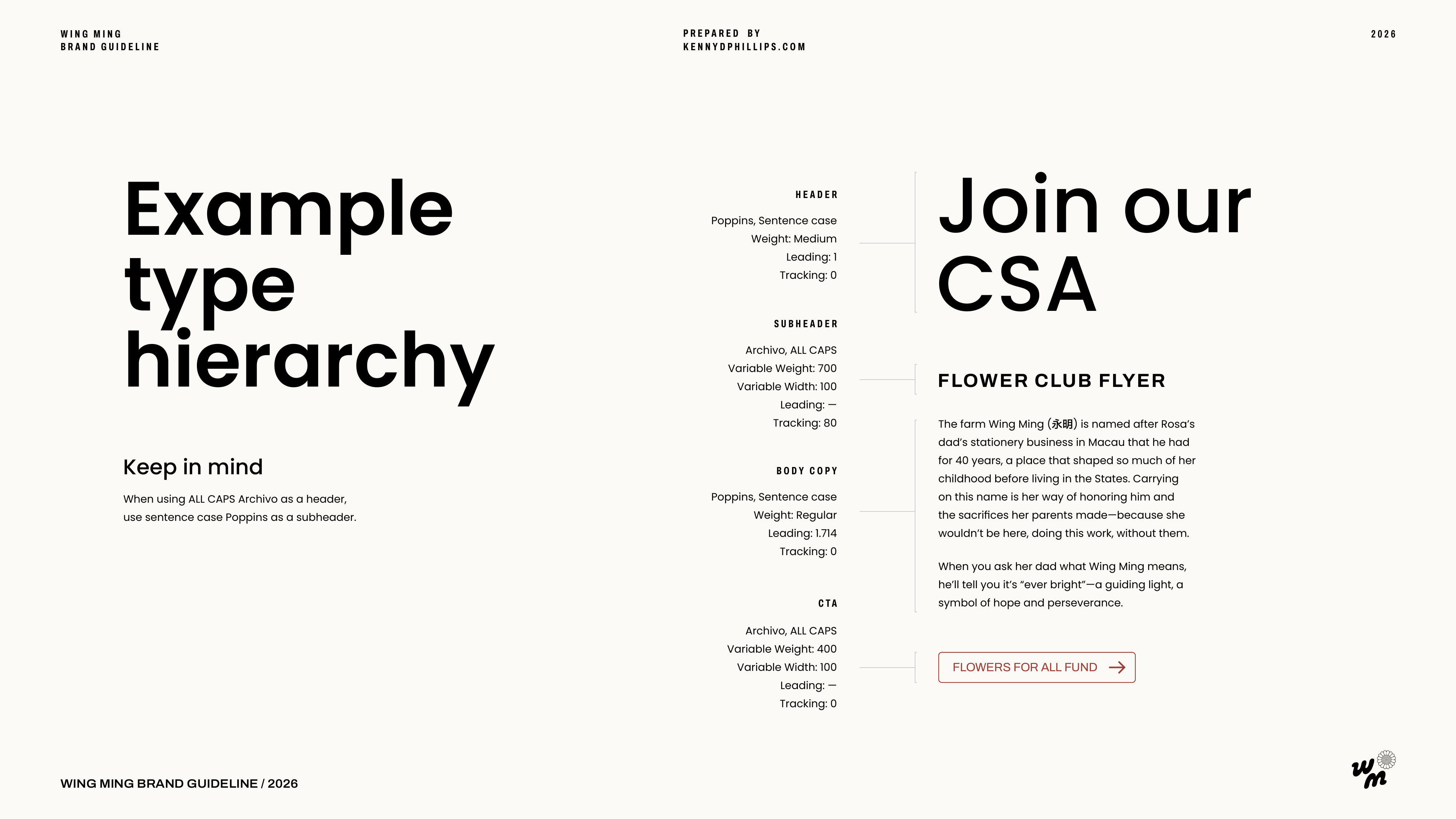
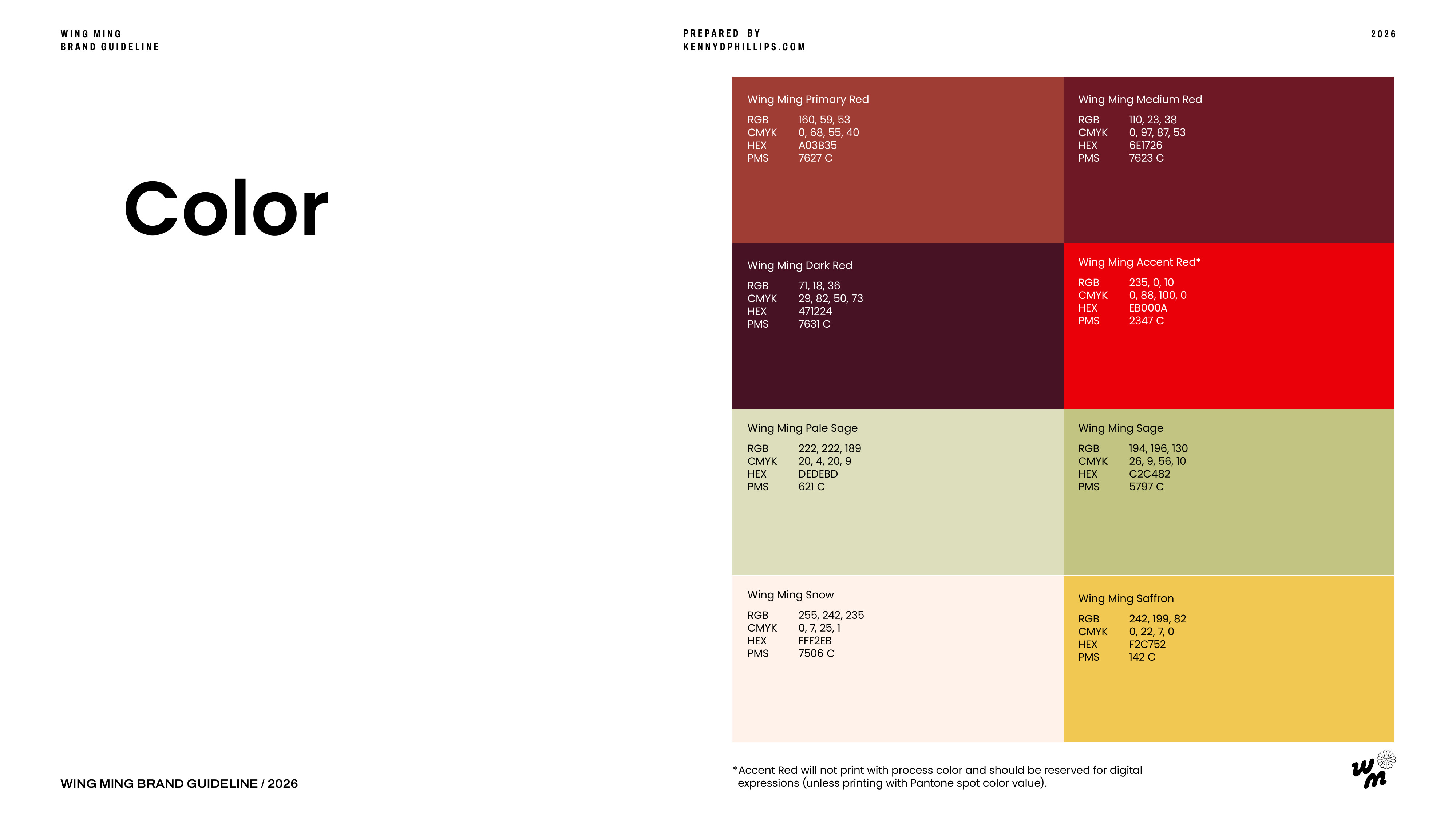
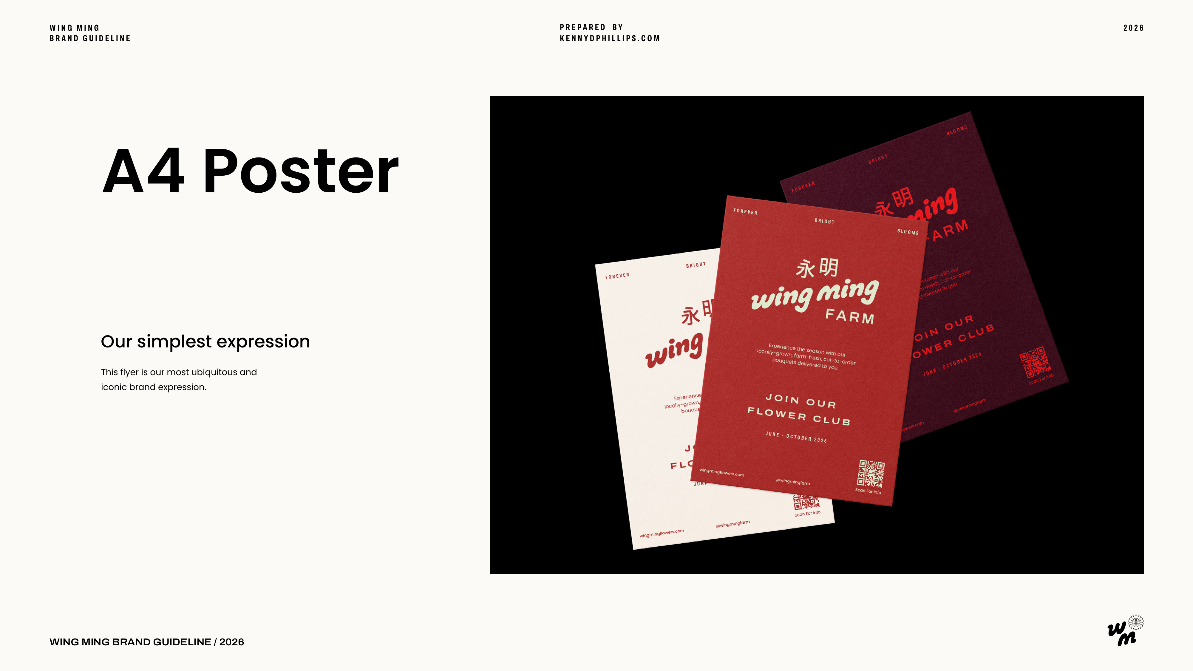
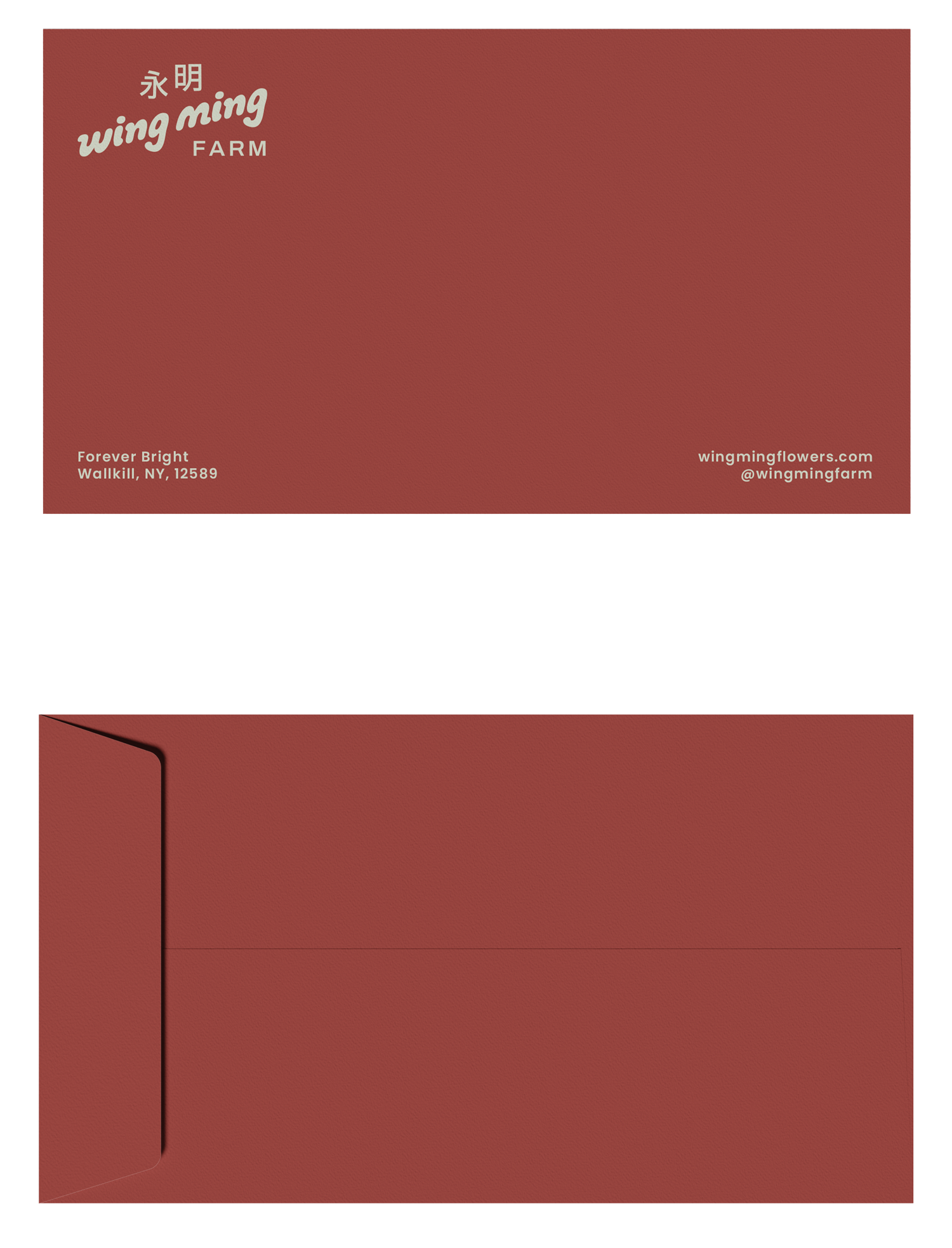
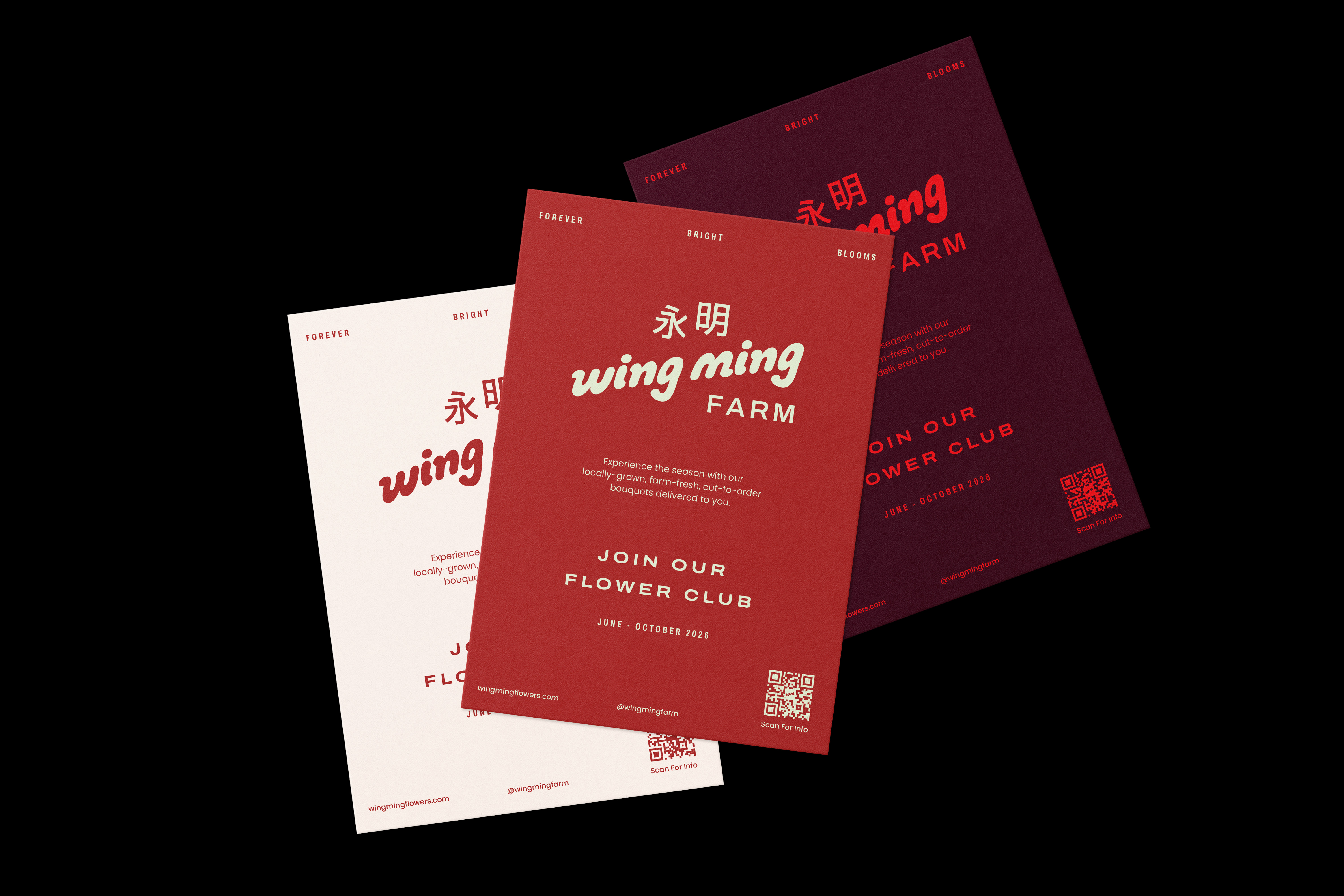
The work spans logo design, a full brand identity system, brand guidelines, print templates, production-ready assets, and art direction covering typography, color, and photography.


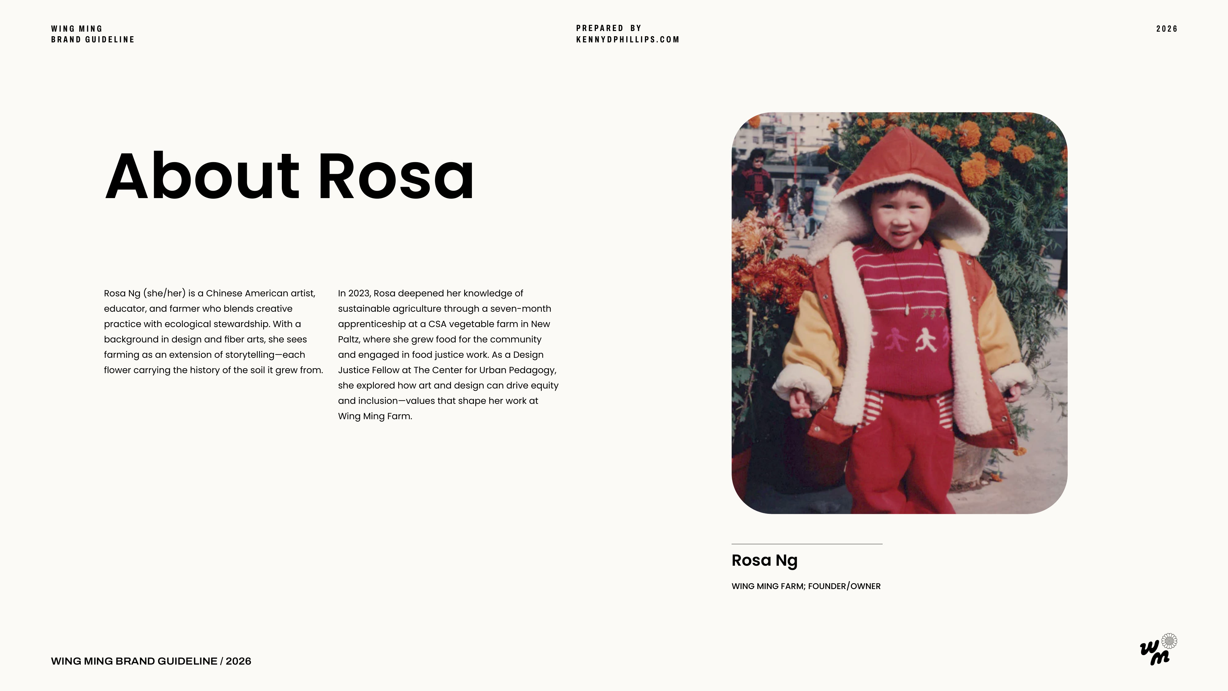
Rosa, Wing Ming's founder, is also a part-time assistant professor teaching creative knitwear design and machine knitting at Parsons School of Design. She knitted this sign of the logo for her farmer's market booth.


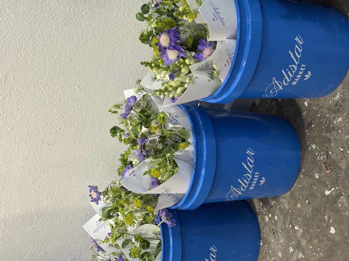
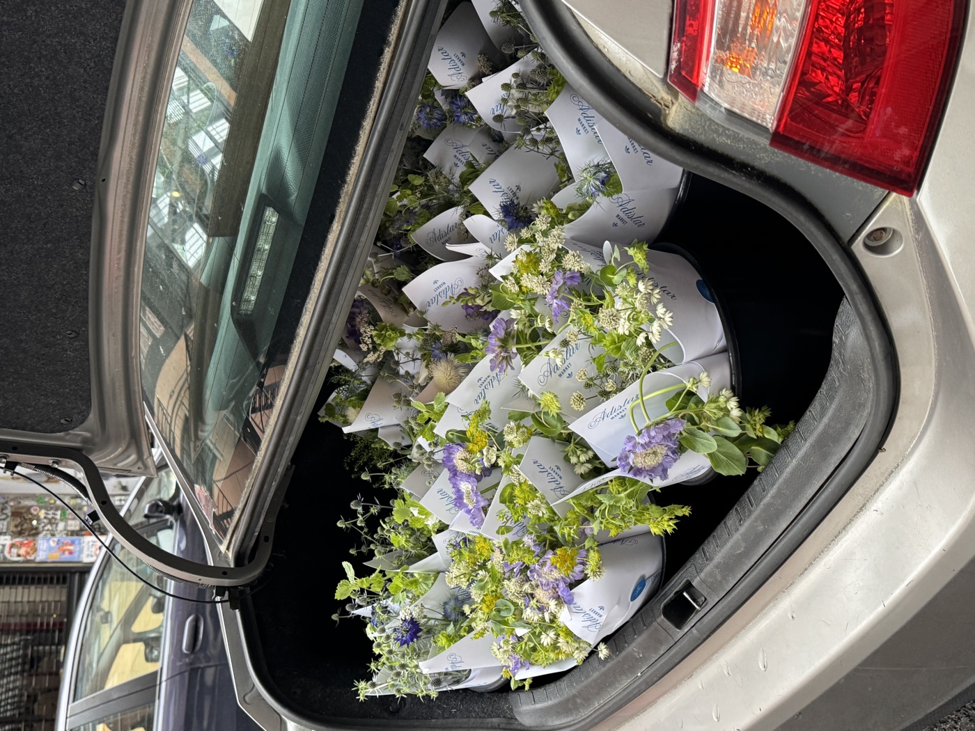
For the Adidas Adistar launch in Chinatown, Wing Ming supplied 250 seven-stem bouquets as give-aways, tucked into a bodega-style installation alongside boutique groceries and dry goods. A Hudson Valley flower farm, in the middle of New York City, alongside a global sneaker launch.