
Brand IdentityLogoGuidelinesCampaignWayfindingColor SystemTypography
Go to websiteEndeavor Health launched in 2023 as one of the largest healthcare systems in the Chicago area, built from institutions with decades of separate histories. Working with TRIPTK, I helped build the brand identity tasked with making it feel like it had always been one.
As a design director on the project, I owned the logo, the design system, and wayfinding, and led client presentations through the CEO logo review where the final mark was selected. The challenge was giving four institutions with their own loyal patients one voice, without any of them feeling absorbed by the others.


Four institutions, each with its own loyal patients, needed one mark that none of them could claim. Dozens of iterations later, the team landed on a monogram E built from three stacked strokes, steady enough to anchor a hospital system and enough of a sense of movement to feel like it’s headed somewhere. Paired with ES Klarheit Grotesk by Extraset, it’s a quiet core that lets the campaign do the talking.
Endeavor is a company name that works as a verb, and the campaign leans on that. Your best health is our endeavor makes the promise and signs it in the same sentence. The italic word in the middle shifts with whoever is reading, while the ending never moves.


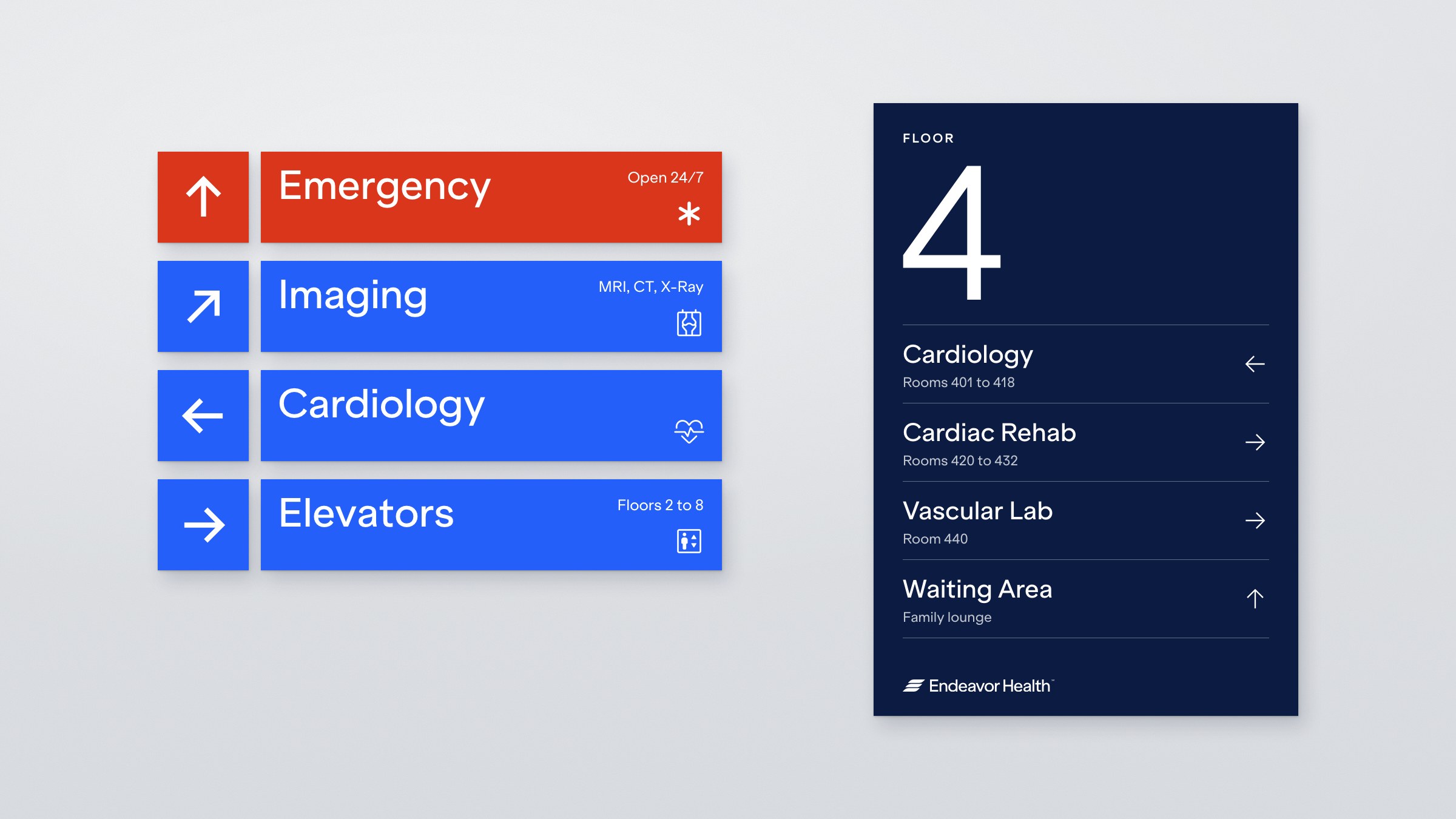
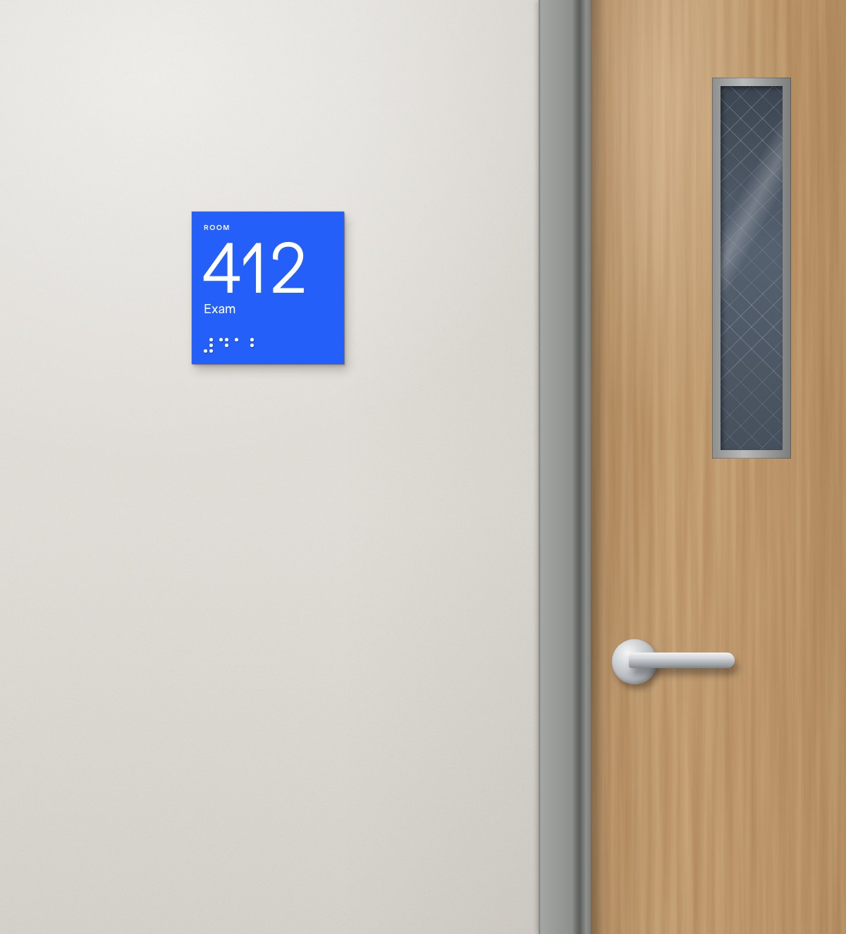
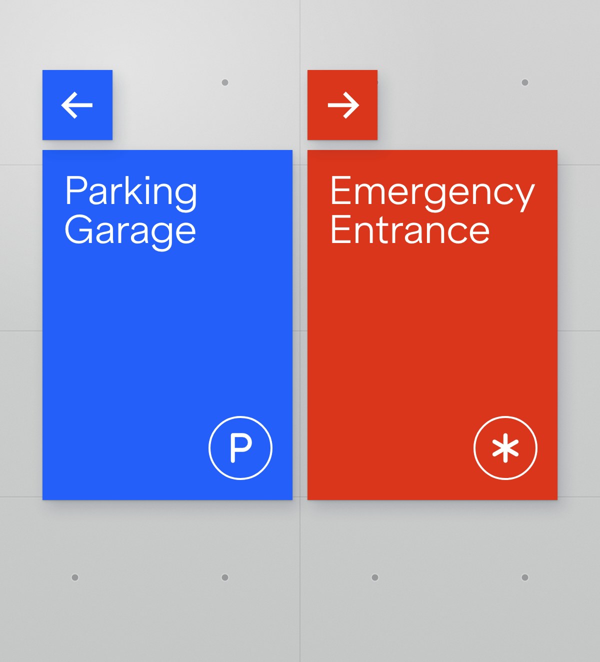
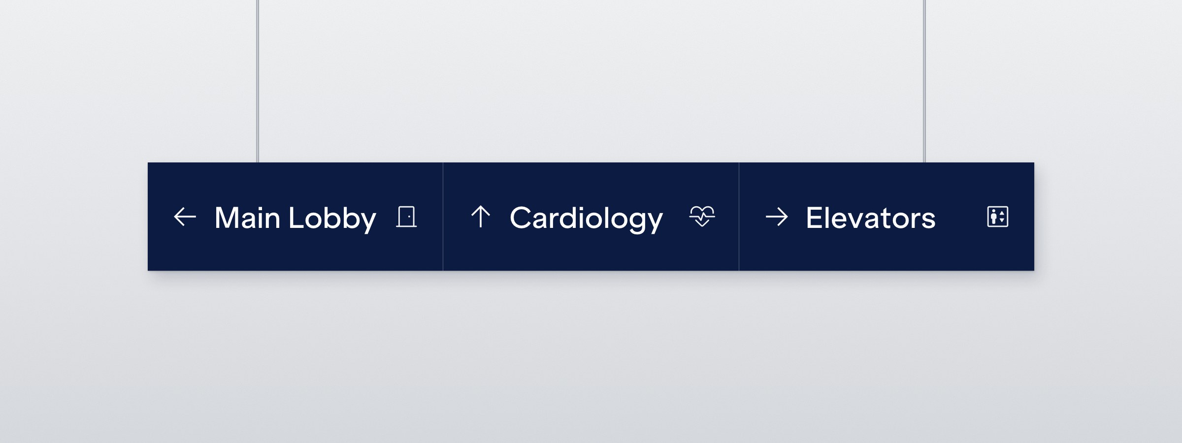
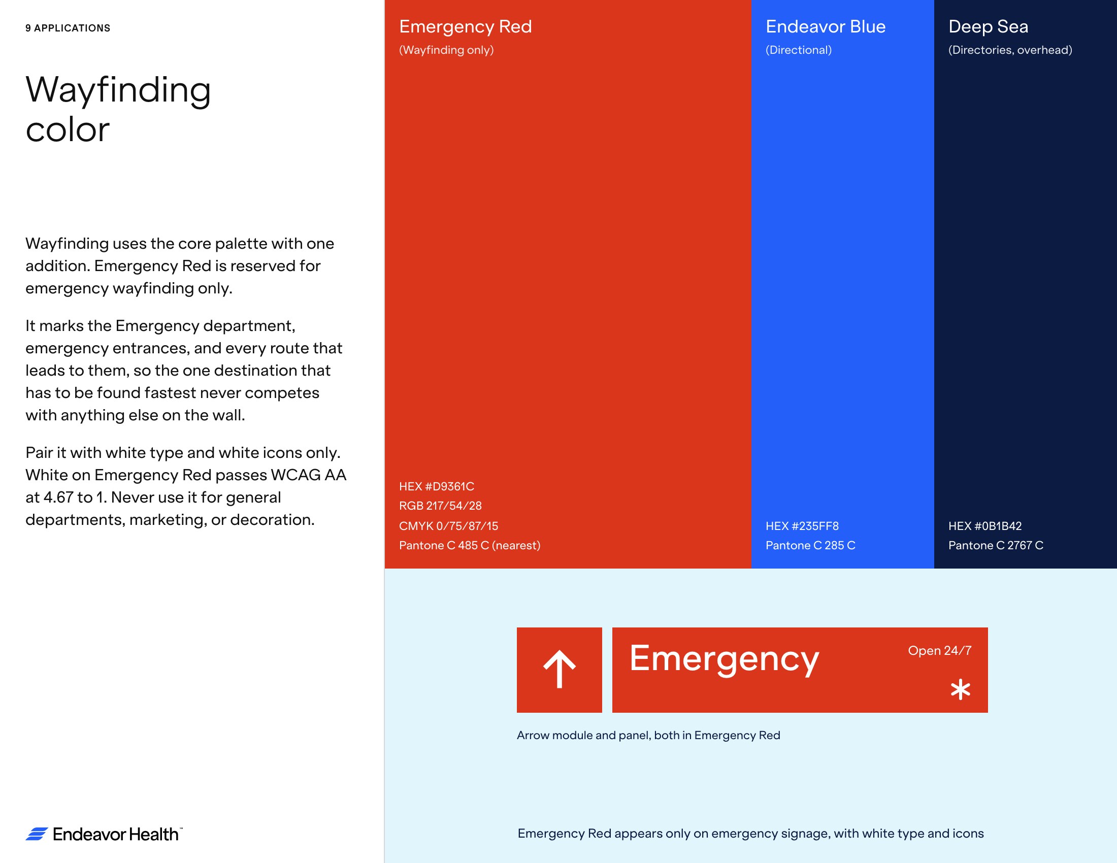
Wayfinding has to work for someone who is scared, rushed, or both. Every sign is built from the same parts, a blue panel, a destination in Klarheit Medium, an icon in the corner, and a separate arrow module, so a direction can change without remaking the sign. A dedicated Emergency Red, warmer and darker than the brand’s Tangelo so white type stays legible, is held back for the one place on campus that has to be found in seconds.


Within a year of launch, Endeavor Health was showing up where Chicago actually lives. The logo appears on the ice at United Center during Blackhawks games, and in Season 3 of The Bear, in the hospital where Natalie gives birth. Not placed. Just present.

