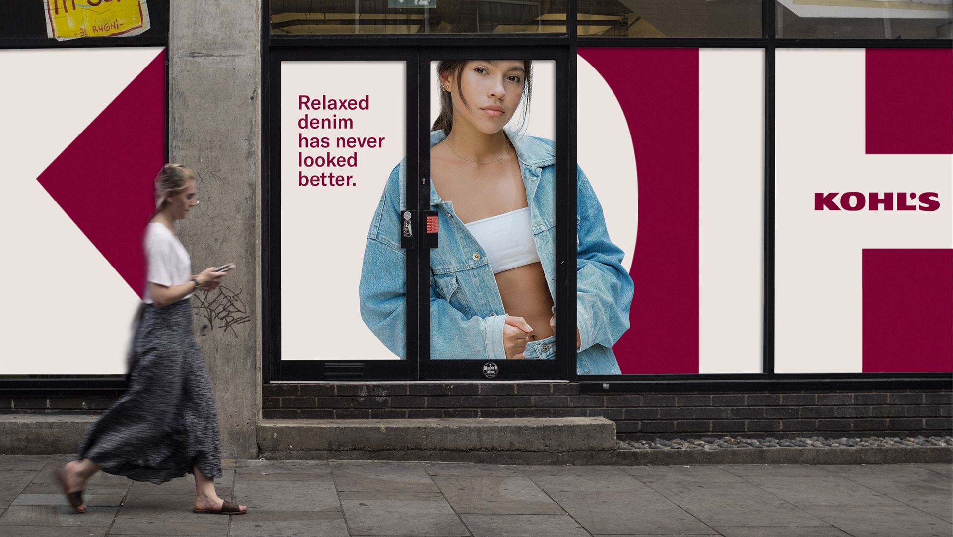
Initial research revealed a key design challenge: We needed to both strengthen Kohl’s brand equity through a more intentional implementation of the existing wordmark, and to inject a consistent application of a primary color across digital and physical touchpoints.
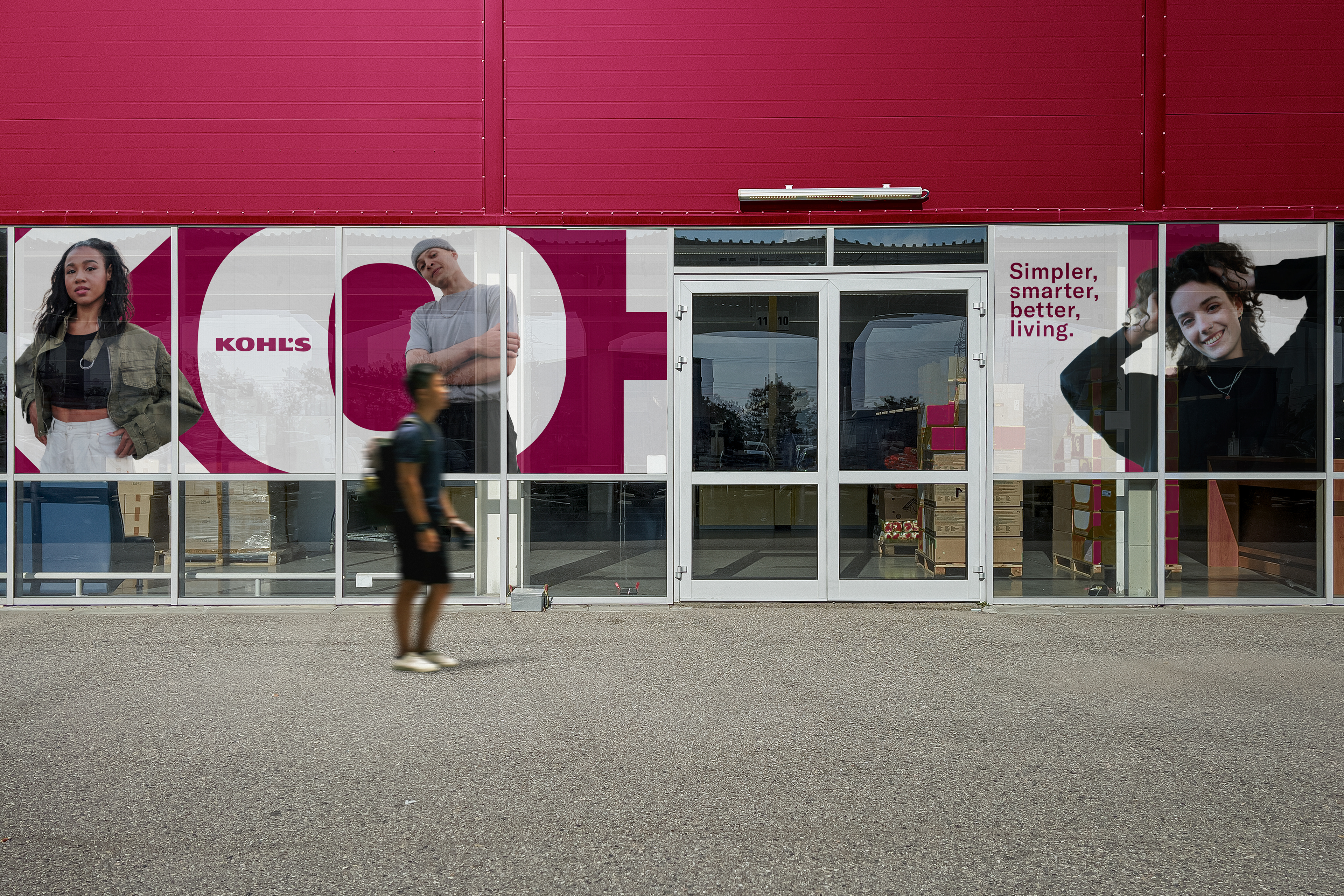
We addressed this by developing a layout system inspired by the logo and introducing a signature color we call Berry.
We addressed this by developing a layout system inspired by the logo and introducing a signature color we call Berry.

GT America gives
Kohl’s flexibility in their communications.
The extended weights create a strong synergy with their wordmark—building on the brand’s history while speaking in a contemporary typographic voice.
The extended weights create a strong synergy with their wordmark—building on the brand’s history while speaking in a contemporary typographic voice.

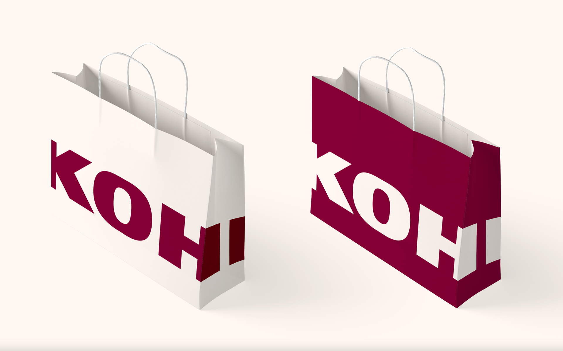
Playful use of their logo allows the brand to show up in new ways.