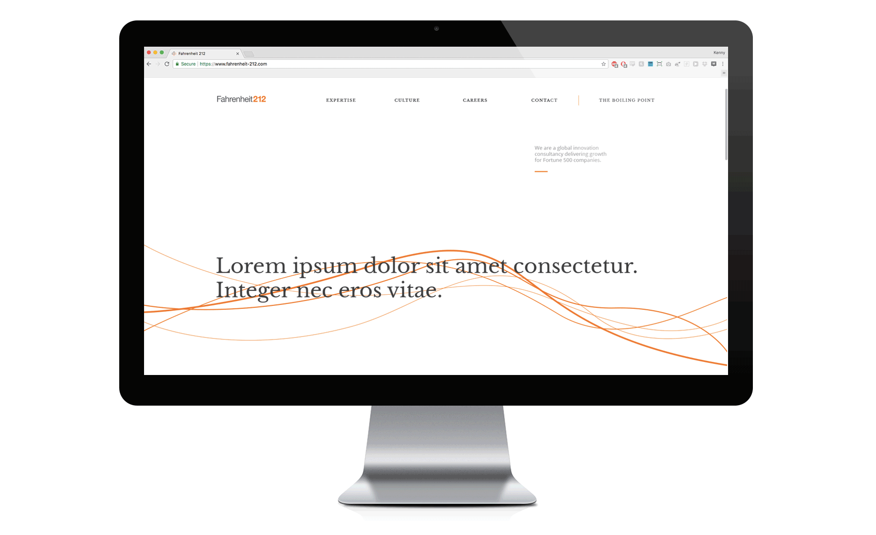
I worked alongside their senior designer, Charlie, to take Fahrenheit-212 from Illustrator desktop comp concepts, to their new responsive redesign.
Charlie had a distinct vision for typographic style, layout (on desktop), UI animations, content transitions, and UX parameters/necessities. A few problems were that he hadn't worked alongside a dev team on a responsive build before, started designing in Illustrator (the dev team needed Sketch Files), and he started without a grid system or a modular typographic system.
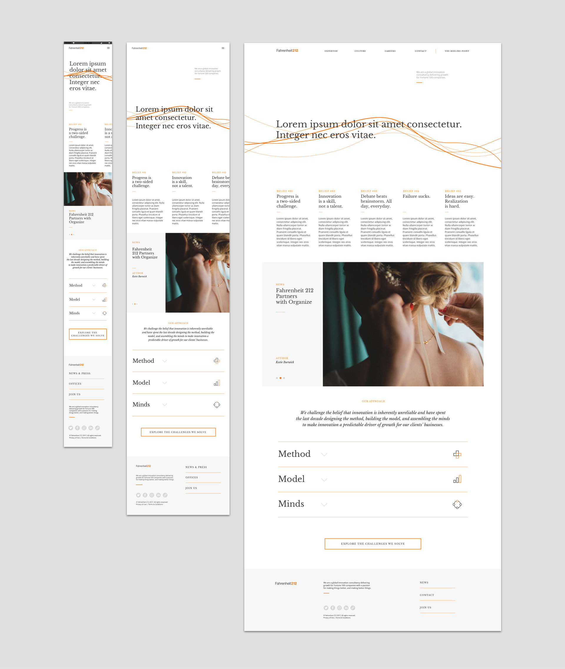
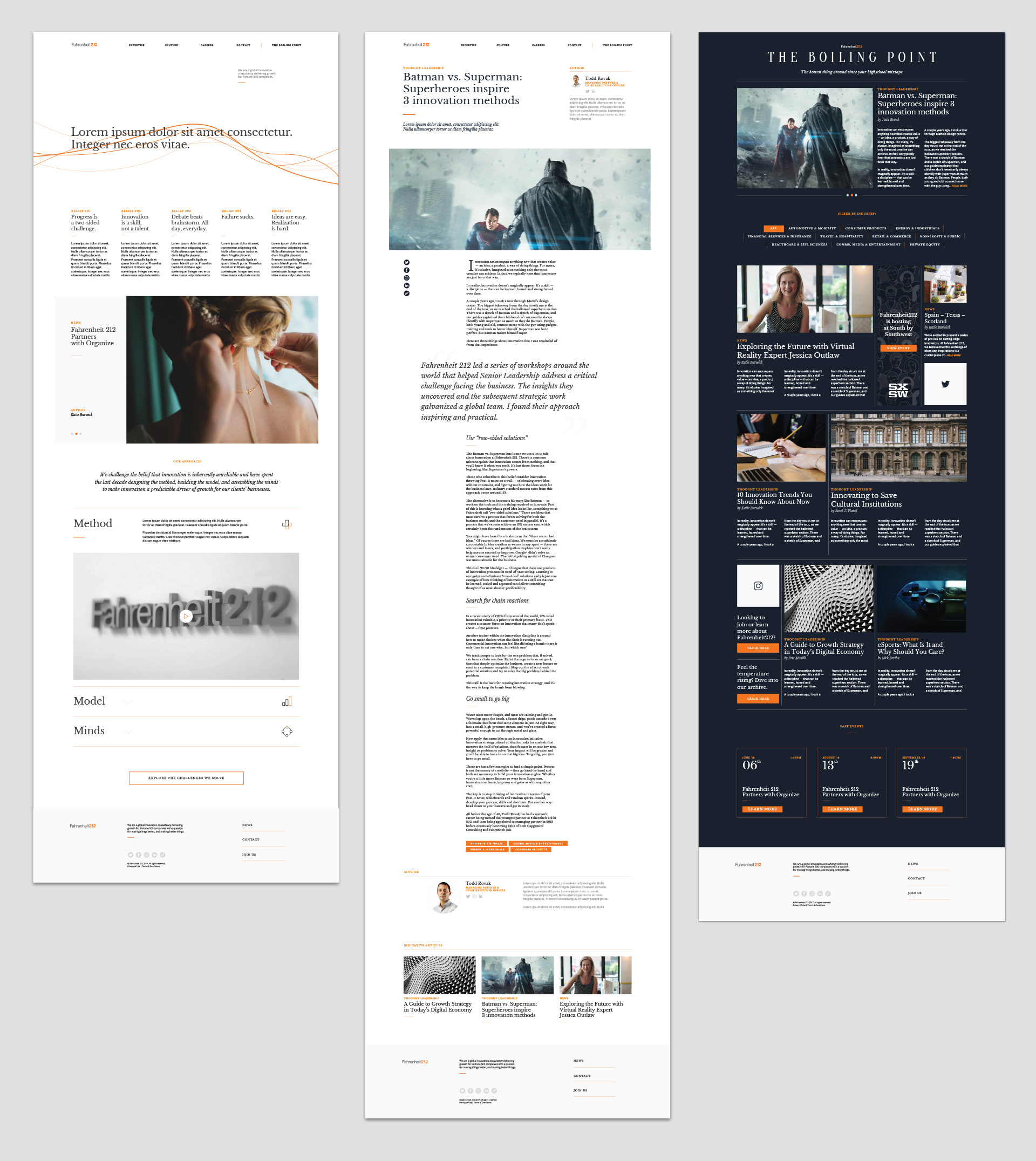
I was there to help translate the Illustrator starting-point into desktop comps in a Sketch file—and after that into tablet and mobile (we didn't do mobile first because he already had some desktop progress).
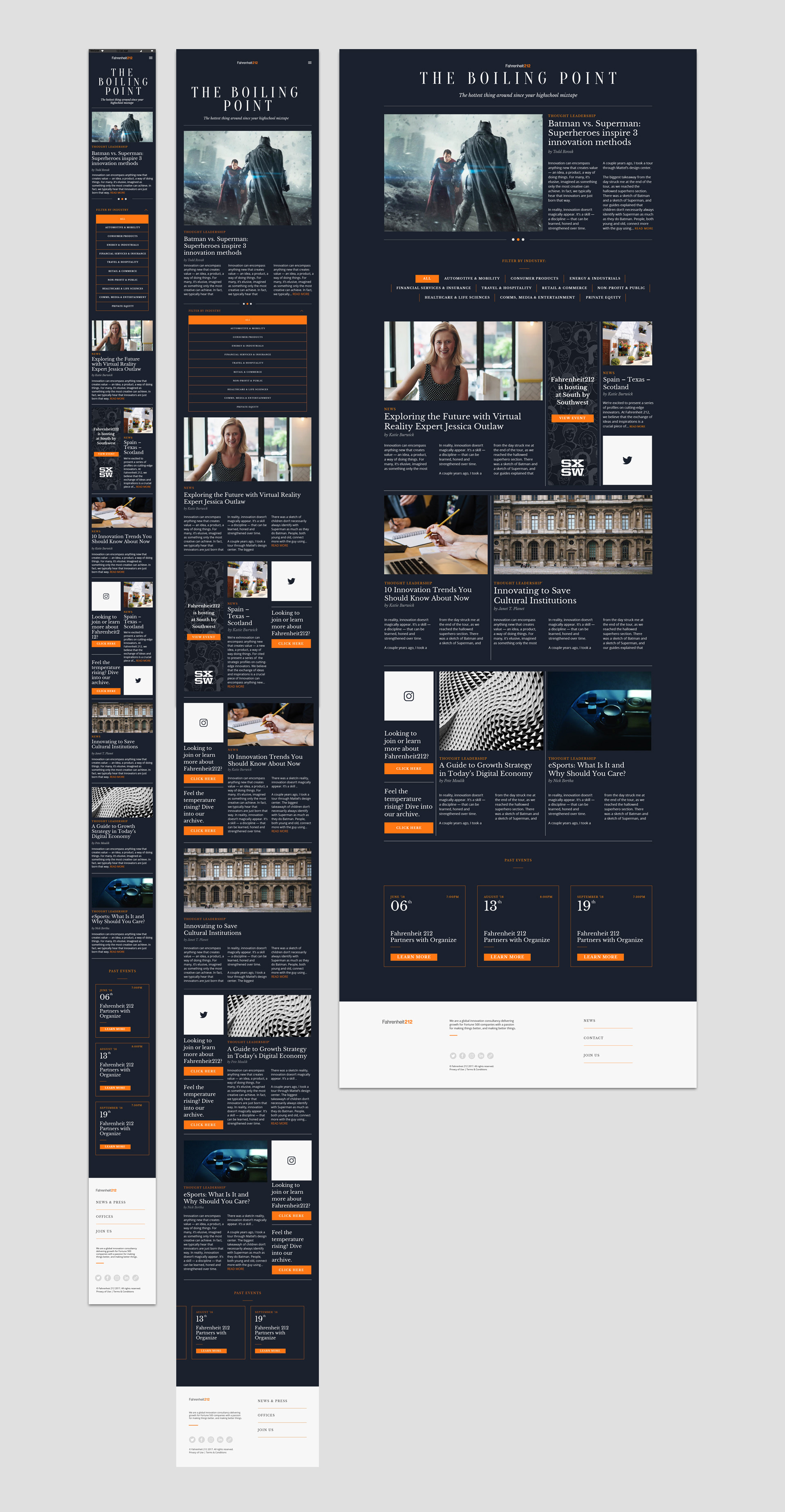
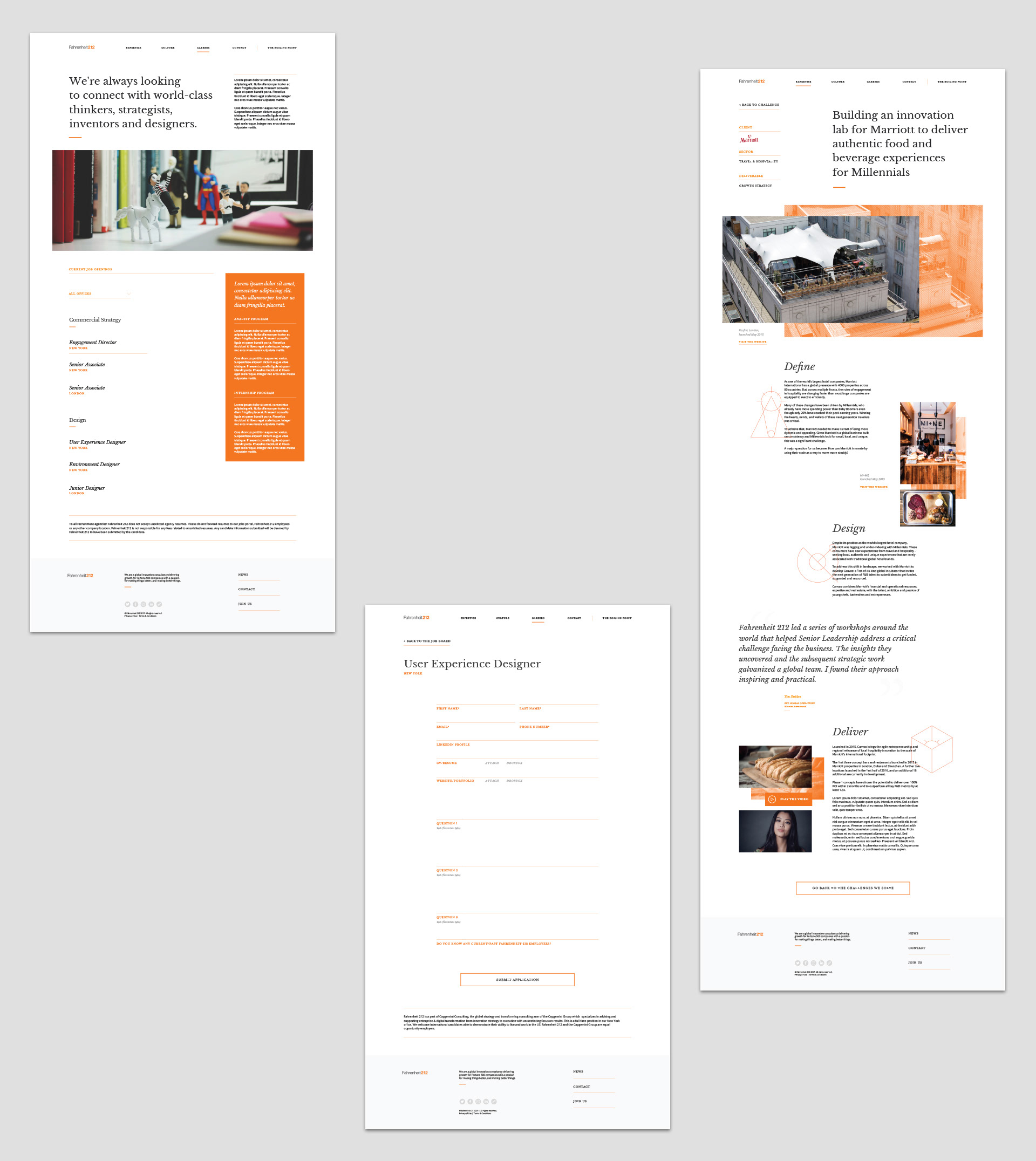
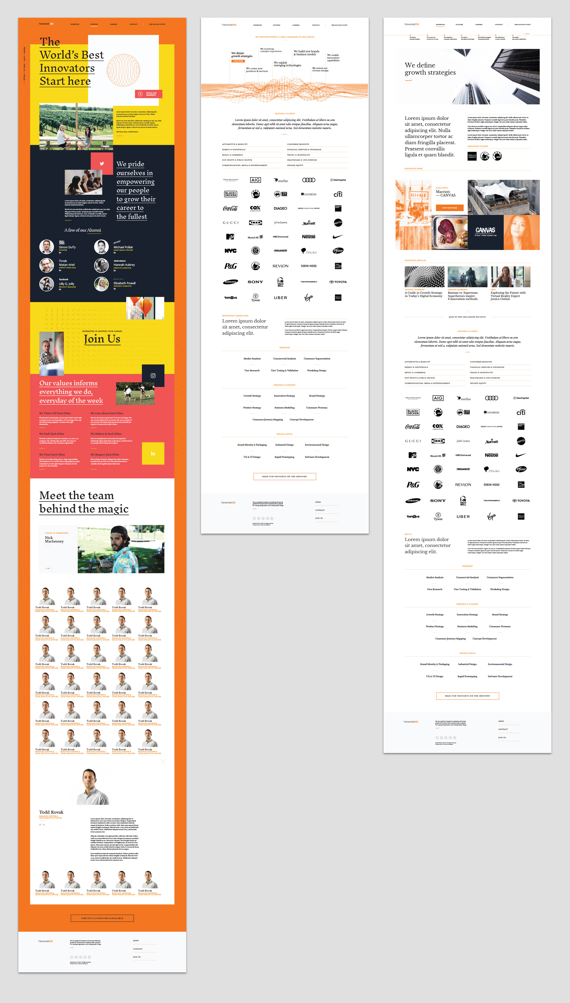
The hand-off of Sketch files included 3 breakpoints—desktop, tablet vertical, and mobile—a comprehensive style guide (becoming a little obsolete as Sketch/Craft is pretty great for informing dev teams of asset specs), a PDF of annotations to clear up any questions and reinforce UX functionality of the UI. I helped bring in a modular scale to Charlie's type sizes—which simplified the levels of hierarchy in the overall typographic style/scheme, internal spacing/padding, build and stick to a grid on all of the breakpoints, and extrapolate all of the settled upon design decisions into the rest of the site map of the website, for all three breakpoints.